Oleksandr Parkhomovskyy is a graphic and type designer from Germany. Originally from Ukraine, he has a strong interest in Cyrillic script. After his design studies he worked as a freelancer for design and advertising agencies, specializing in custom and retail type, corporate design, editorial and web. Now he is back in Hamburg, always on the lookout for interesting projects and collaborations.


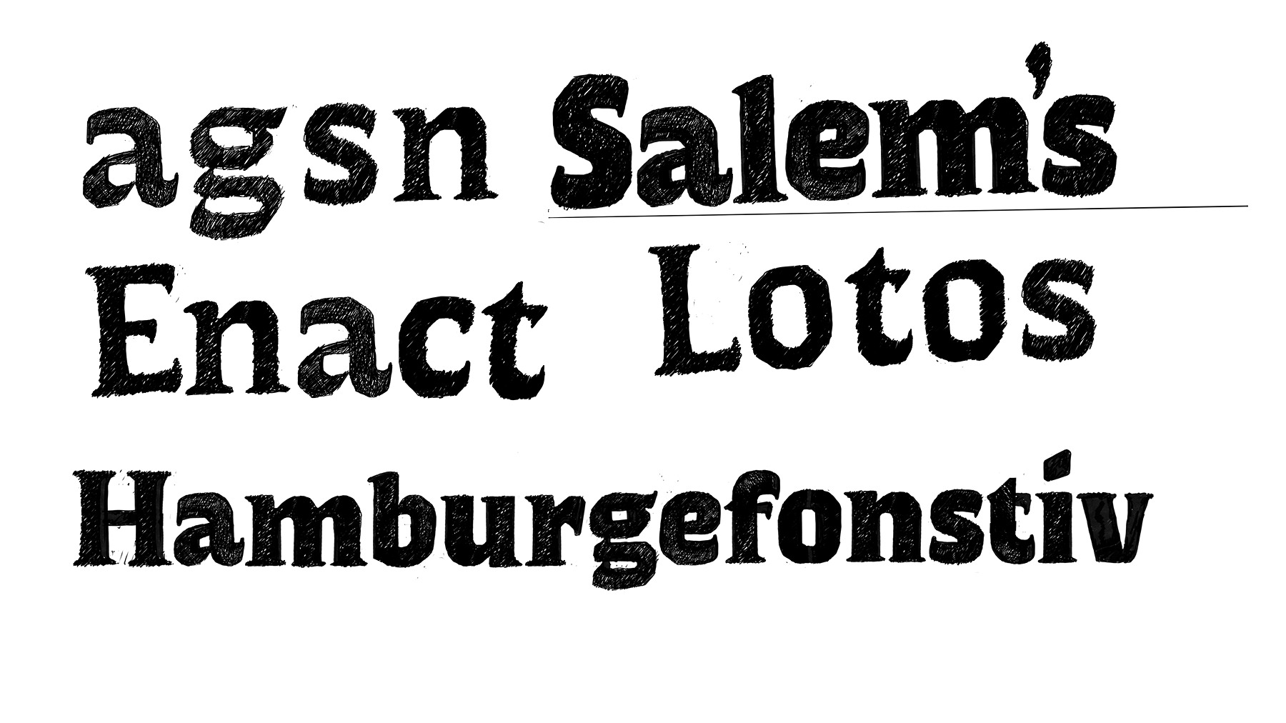
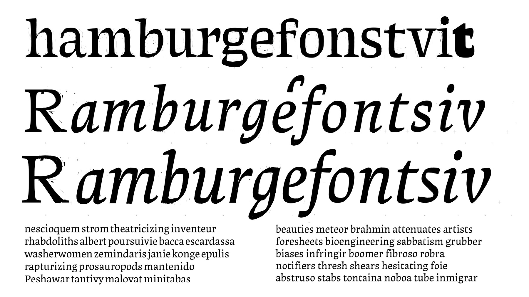
The idea came from the sketches I did when procrastiworking. There were some things that I liked, the angularity, the low contrast, and then the high contrast serifs appeared. The brushiness of the s and e, the melt appearance of vertical serifs on the E. The first digitization was clunky and I struggled to transfer the same feeling.
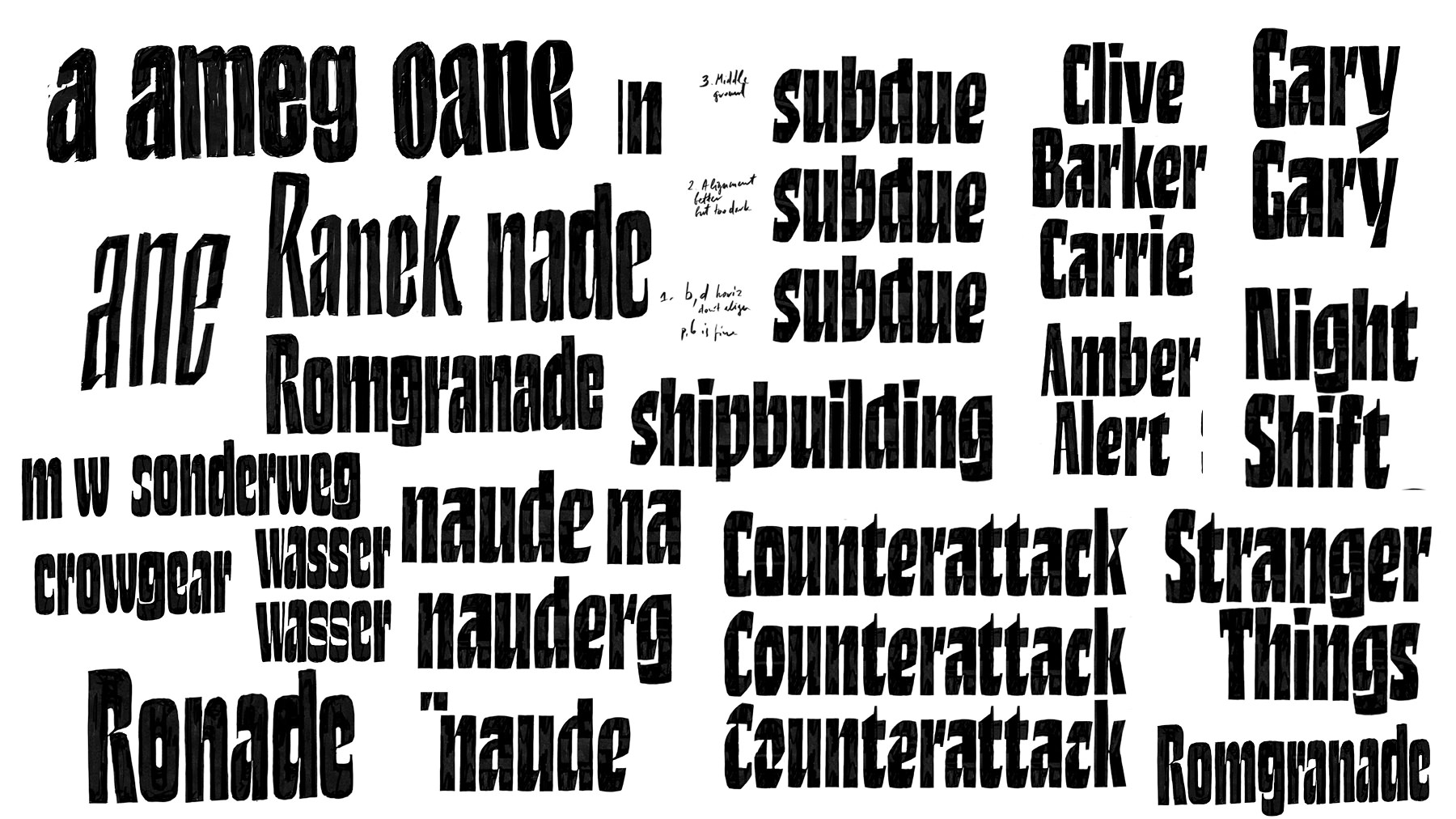
The high contrast serifs worked fine in the black weight but presented some challenges in lighter weights. If the serifs lose weight at the same rate as the stems, they become too insignificant. If they don’t, the effect is lost, and it’s just a regular serif. Nothing wrong with that, but not what I wanted. So I had the idea of getting rid of the serifs while the typeface gets lighter. One axis can do two things at once, Erik said, and that stuck in my head. I needed a way to make the transformation smooth, and it worked much better when there was an intermediate step with a sort of chunky stems.
I liked the high contrast connections and tried to bring the Grotesk and Serif closer together and introduced a sort of a vertical serif. I realized that being narrow, it could only bear that much weight in the stems before becoming normal width. Trying to give it more weight still, I enforced the horizontals. I wanted very short extenders to be able to set very tight lines. Of course, like most of my decisions, it was bound to give me problems. In the end, there were more ideas than time, but that’s ok.