Sander Pedersen is from the south-west coast of Norway. He developed an interest in designing type after getting a bachelor’s degree in graphic design.
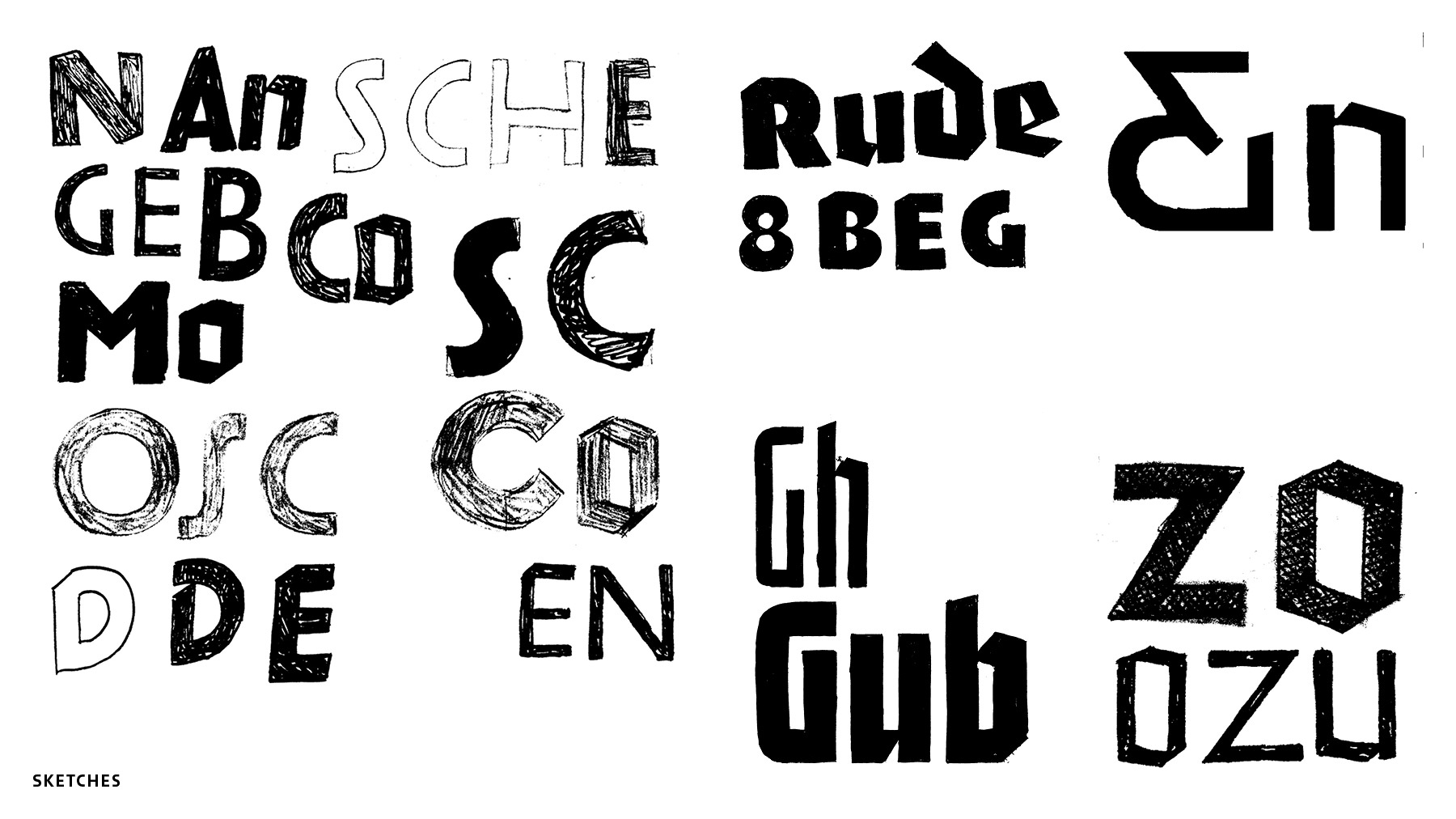
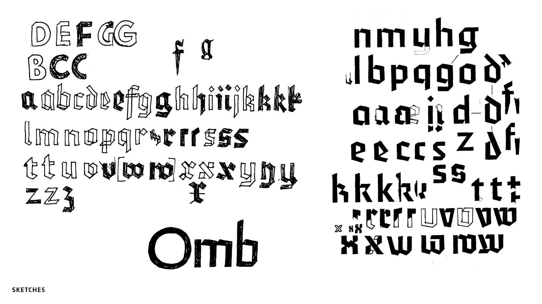
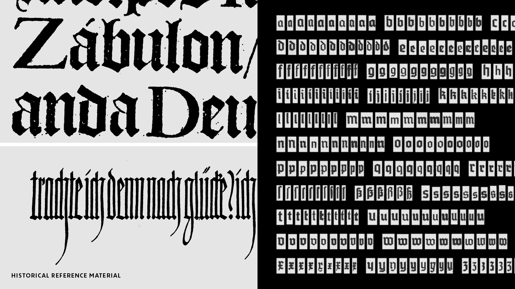
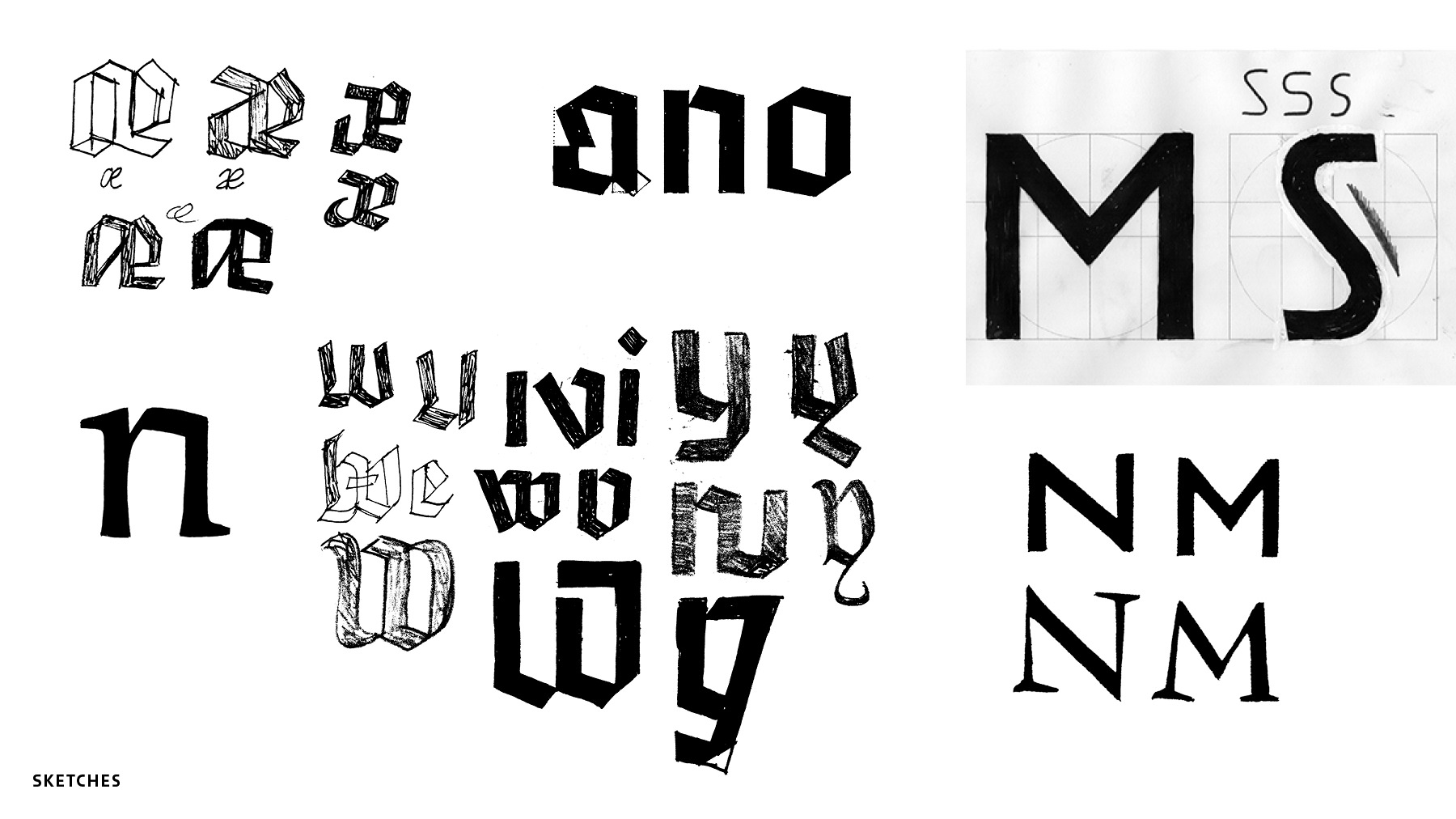
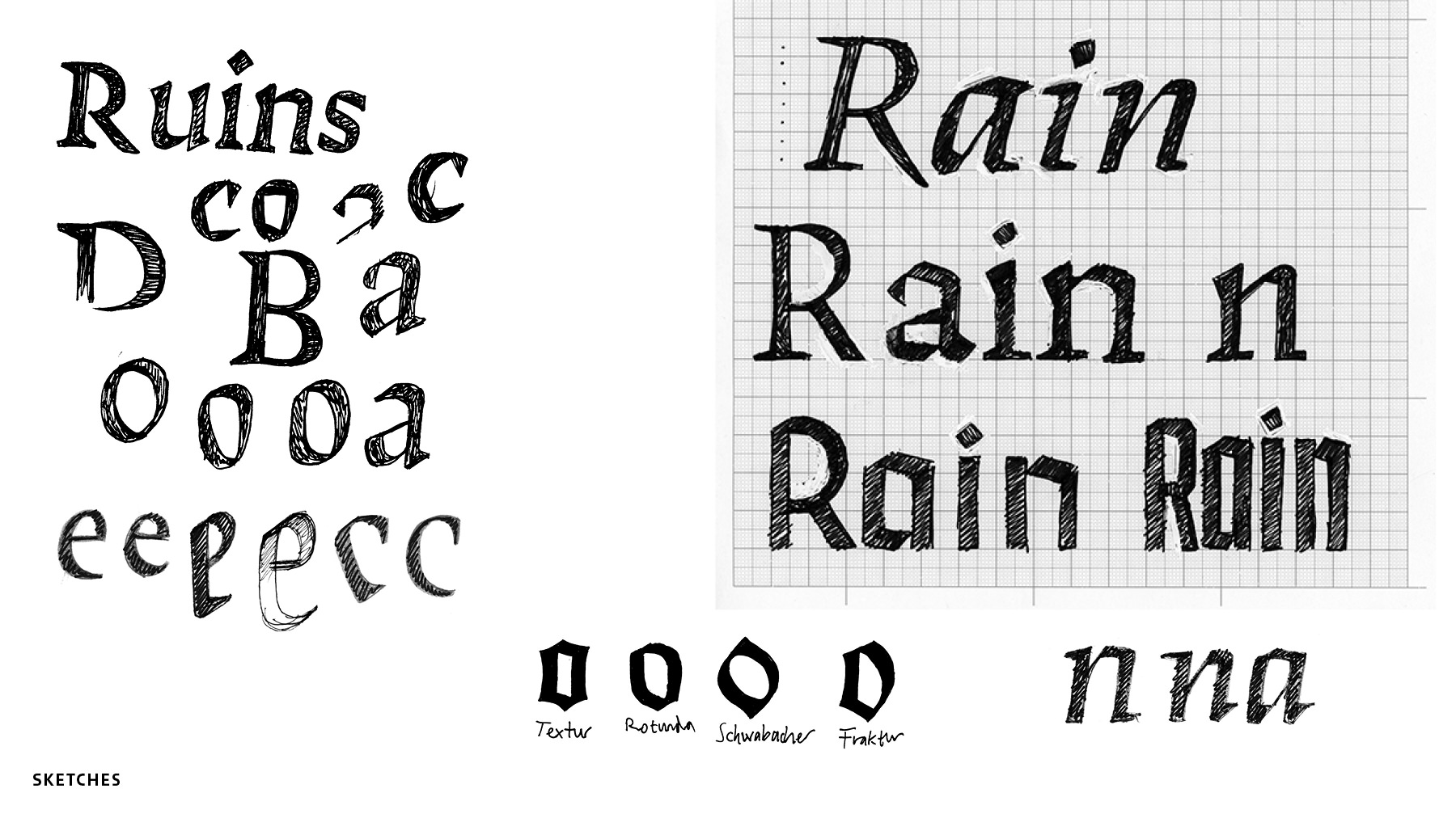
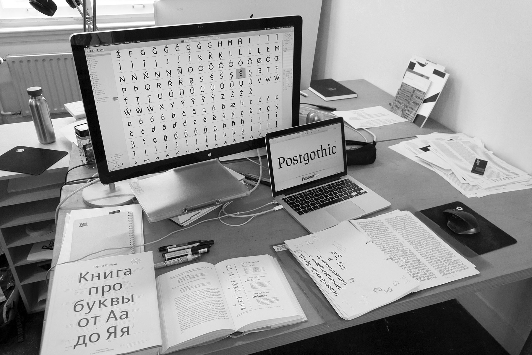
The idea started with the challenge of making an uppercase and lowercase in different styles work together. I wanted to create something new with historical references: the combination of roman capitals with blackletter minuscules, and the modernist simplification of letterforms in the 1920s. The lowercase was pushed to be more contemporary and readable than its sources of inspiration. The Cyrillic was another challenge to design, as the script does not have the same calligraphic blackletter conventions. The lowercase is based on handwritten forms to clarify the core idea. Exploration of a width axis for the Sans became the Compressed style. Blackletter is mainly made of straight stems, so the letters are adaptable to different proportions by just elongating or shortening them. Contextual forms make certain letter combinations with serifs more legible. I also wanted to work more organically with curves and stroke contrast during the semester, which is how the Serif style came about.
