Stef Pauwels is a graphic and type designer from Belgium. After completing a MA program in graphic design at LUCA School of Arts in Ghent, he followed his passion for letterforms and studied Type and Media at the Royal Academy of Art in The Hague. As a designer, he is mainly inspired by typography and experimentation which is clearly visible in his work. When he is not behind his screen he likes to enjoy the Belgian culture and listen to countless hours of music.
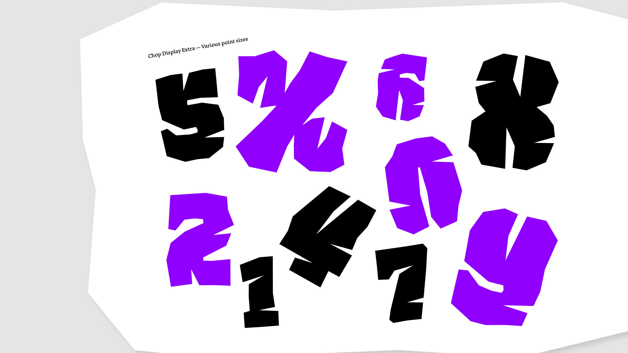
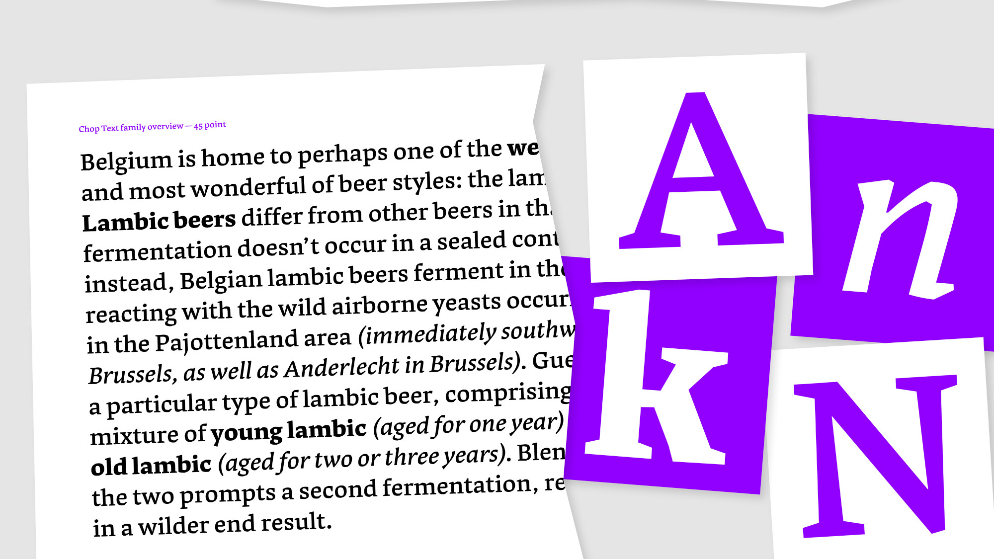
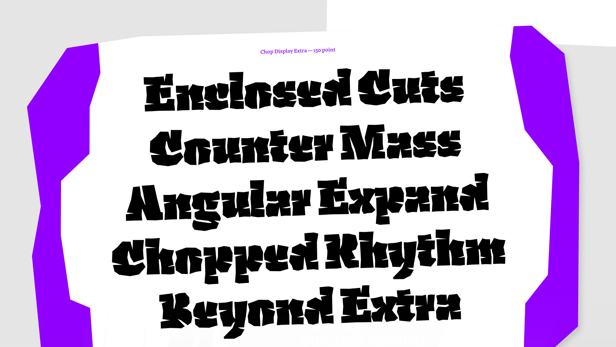
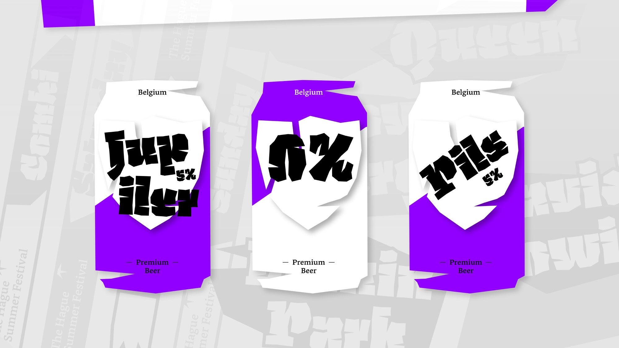
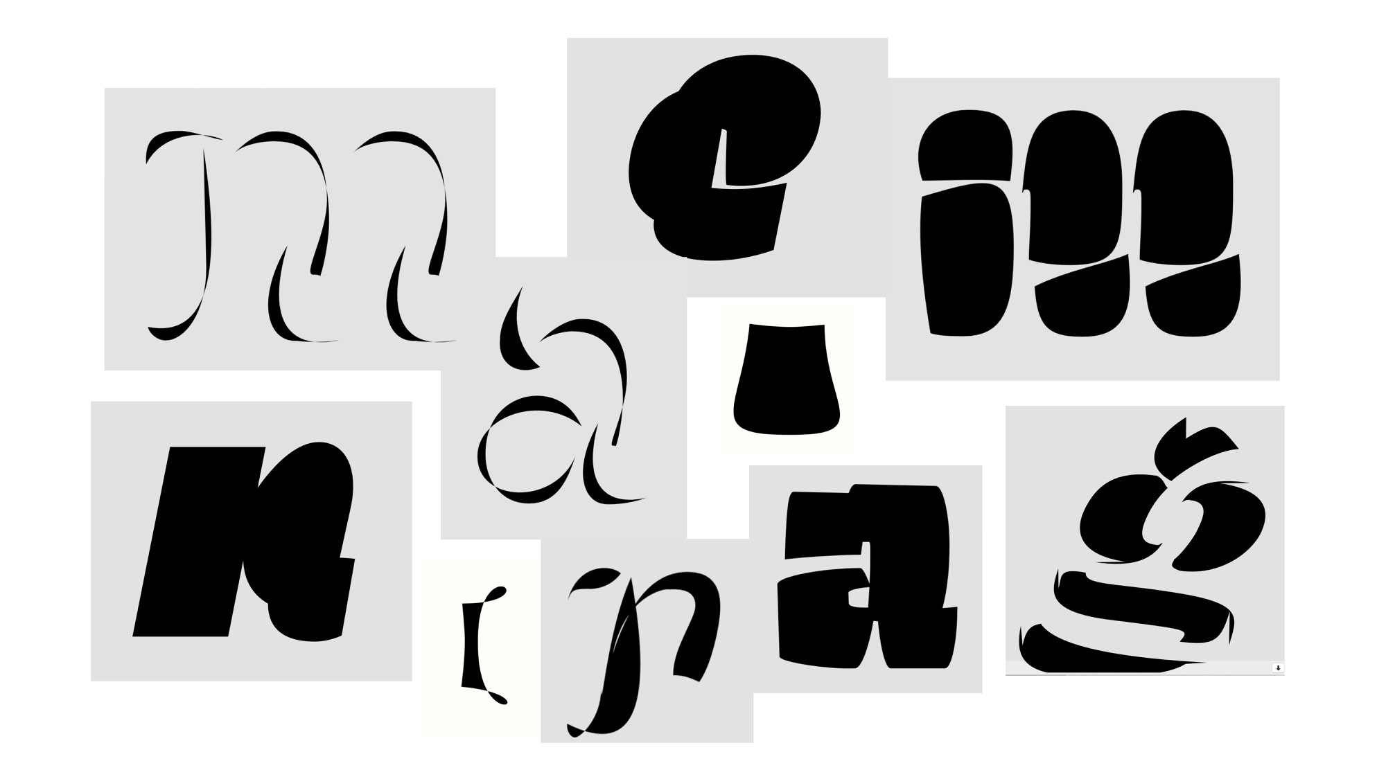
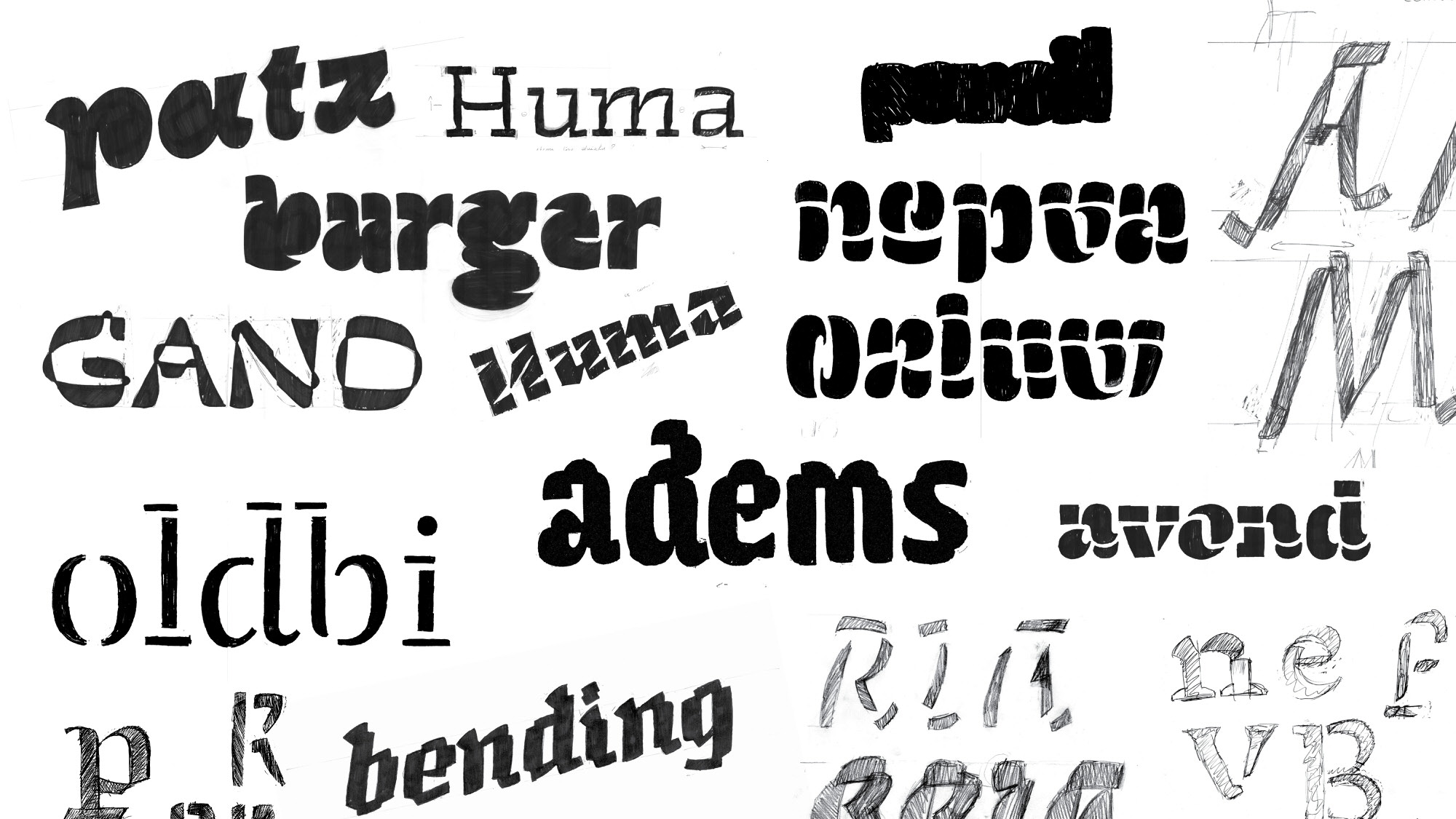
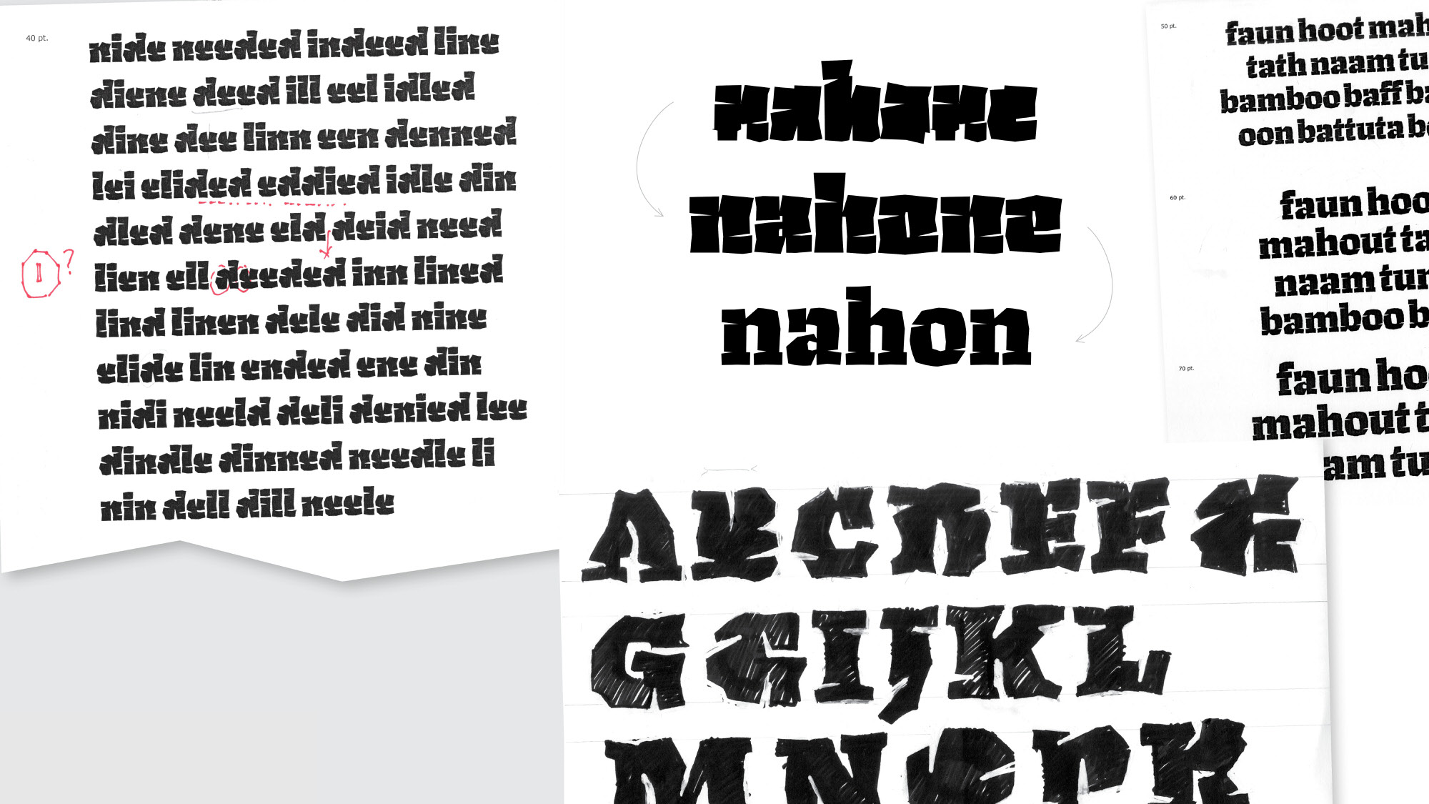
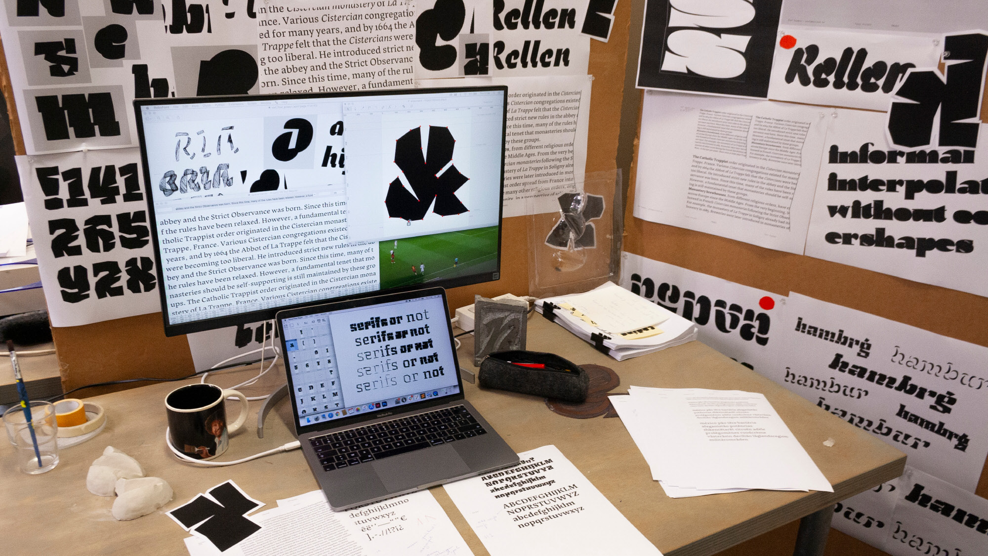
I collected a bunch of screenshots that I had taken throughout the year, all based upon extrapolation. These would be my primary source of inspiration for sketches and family planning. I explored how letters became abstract shapes, serifs started to brake and counter shapes disappeared. The study of these elements defined the angular and almost ‘chopped up’ characteristics of the typeface and the challenges I had to face.
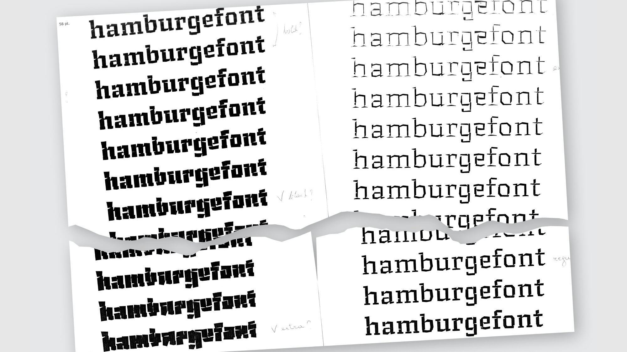
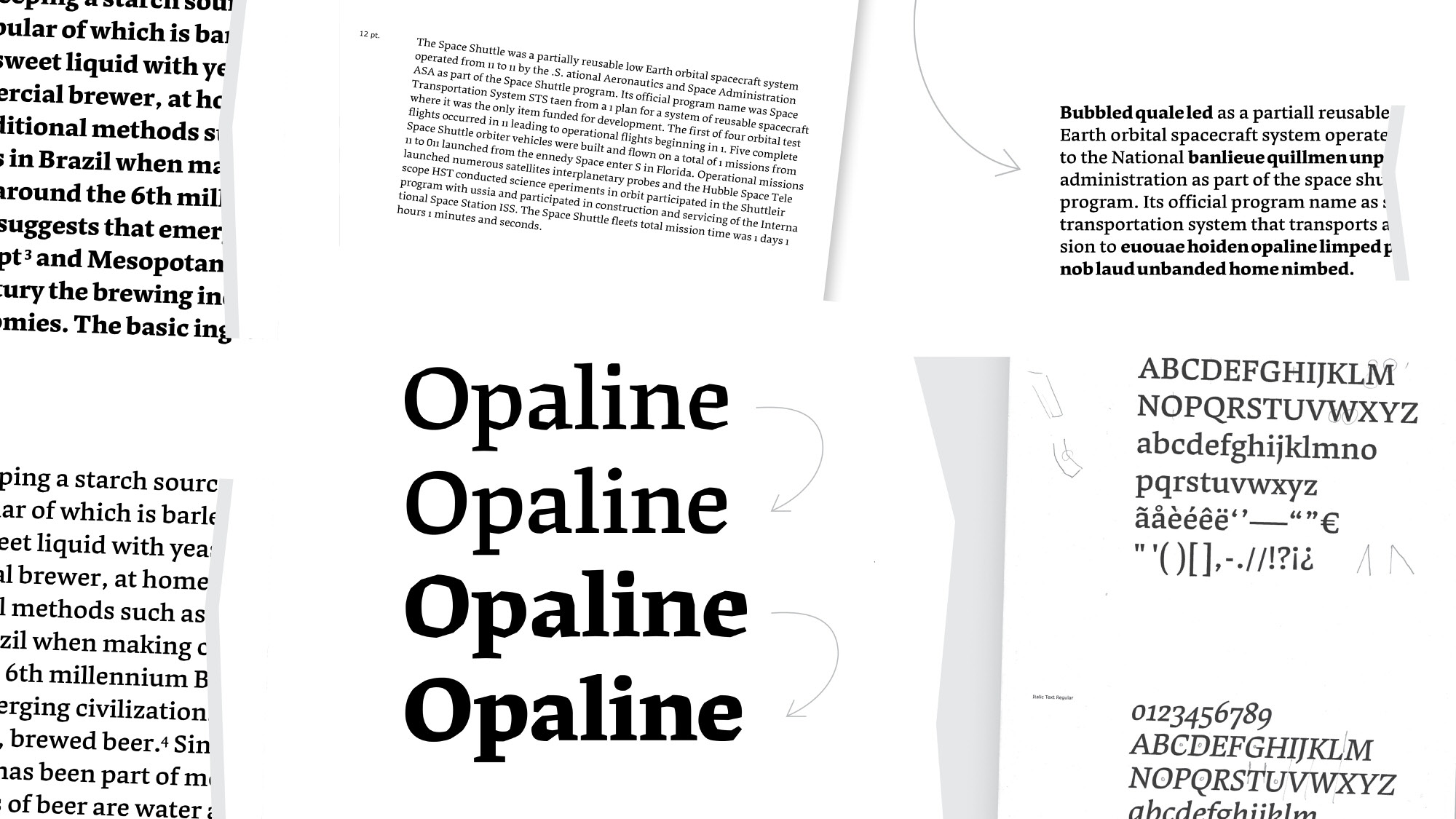
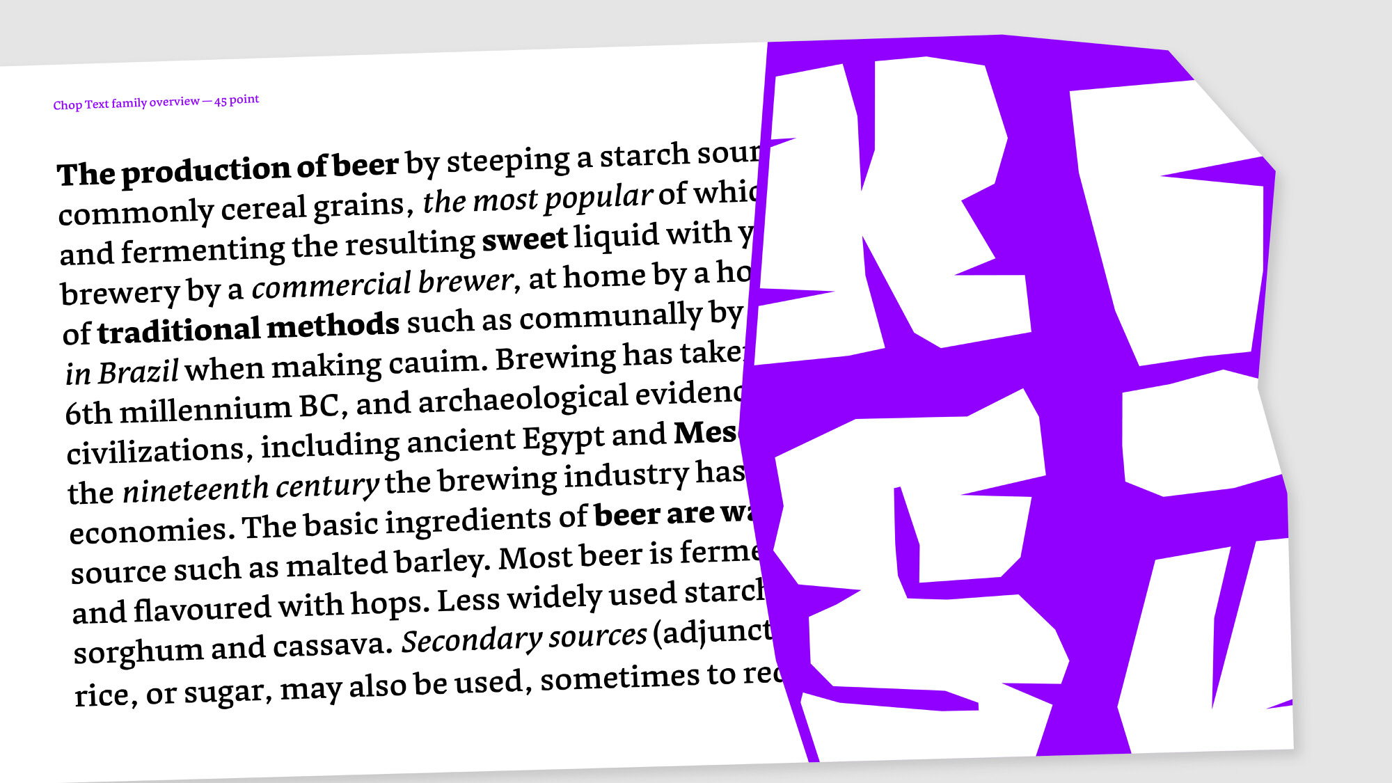
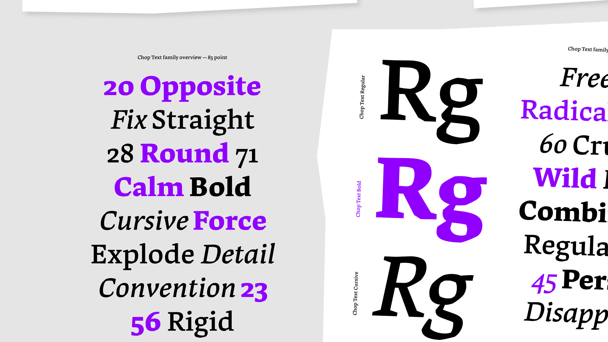
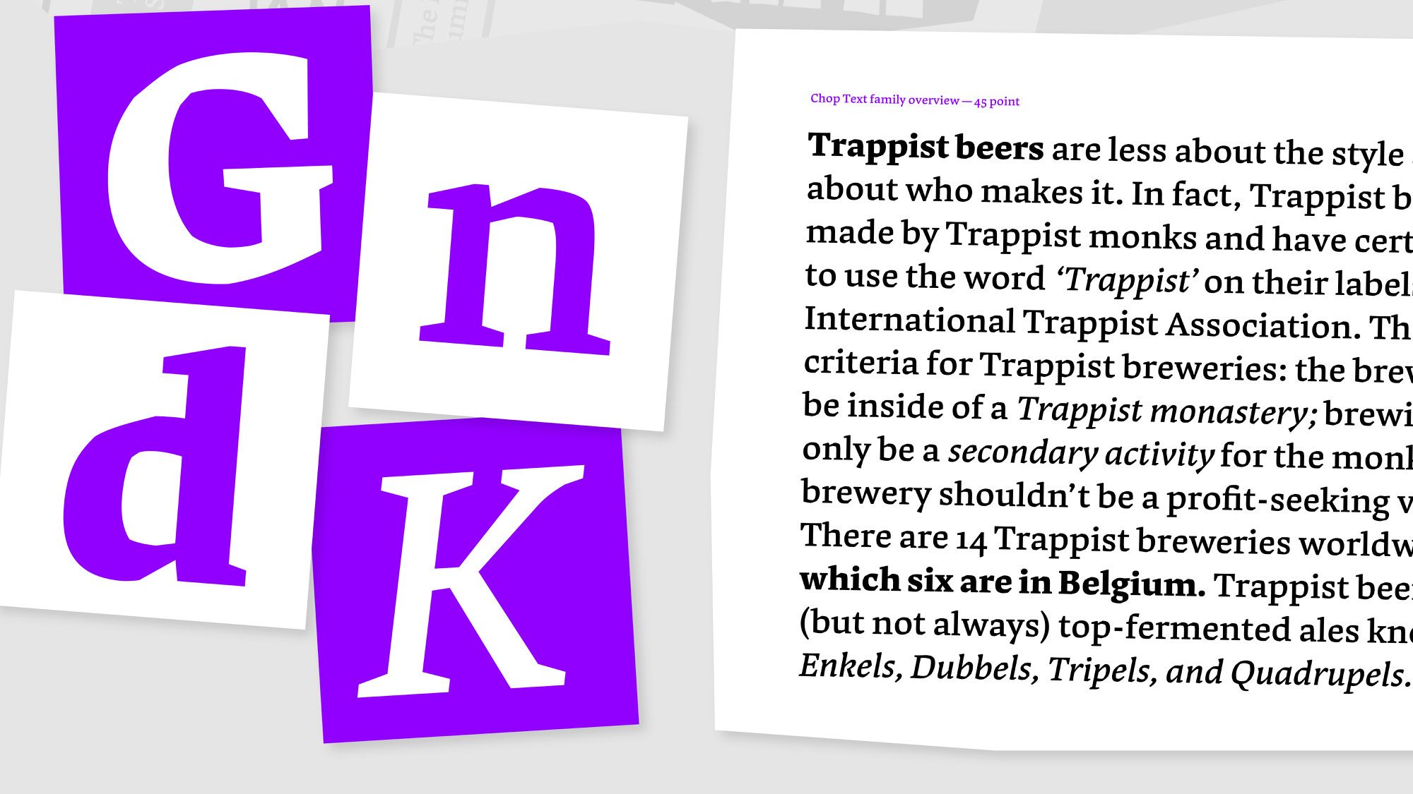
Since I wanted to make the most out of this learning experience, I decided to explore three text styles and one display style. Each of them had its own challenges and problems that needed a solution. Although this was sometimes a frustrating process, it is also what makes type design such a joyful and interesting practice.
In the text styles it was important for me to maintain the angular character of the typeface while keeping a smooth texture for reading. A back and forth process between changing proportions and shapes was needed to deliver a result I was satisfied with.
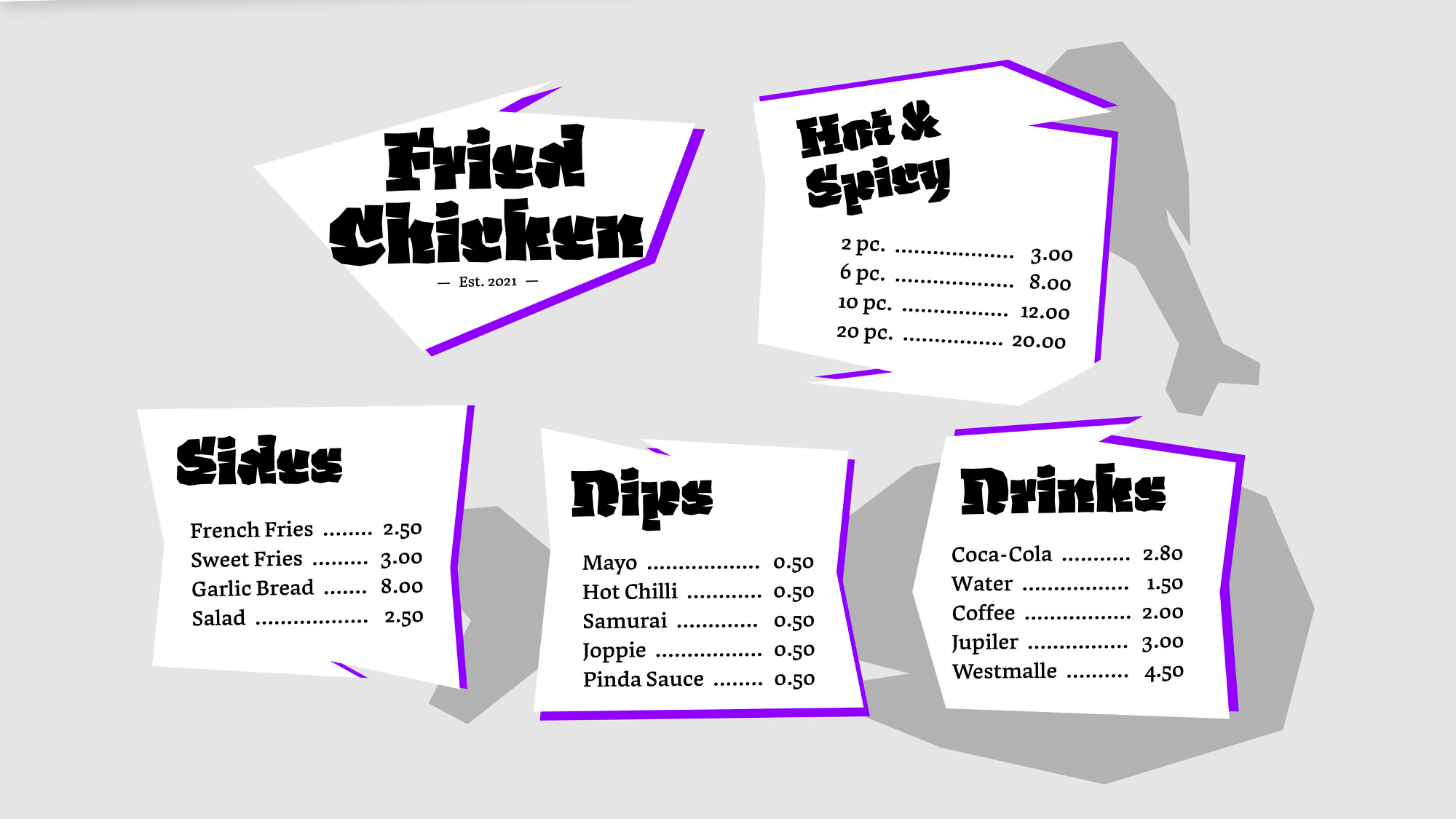
The display on the other hand was more of a balancing game between readability and abstractionism. Allowing a more free and open process which I very much enjoyed.
