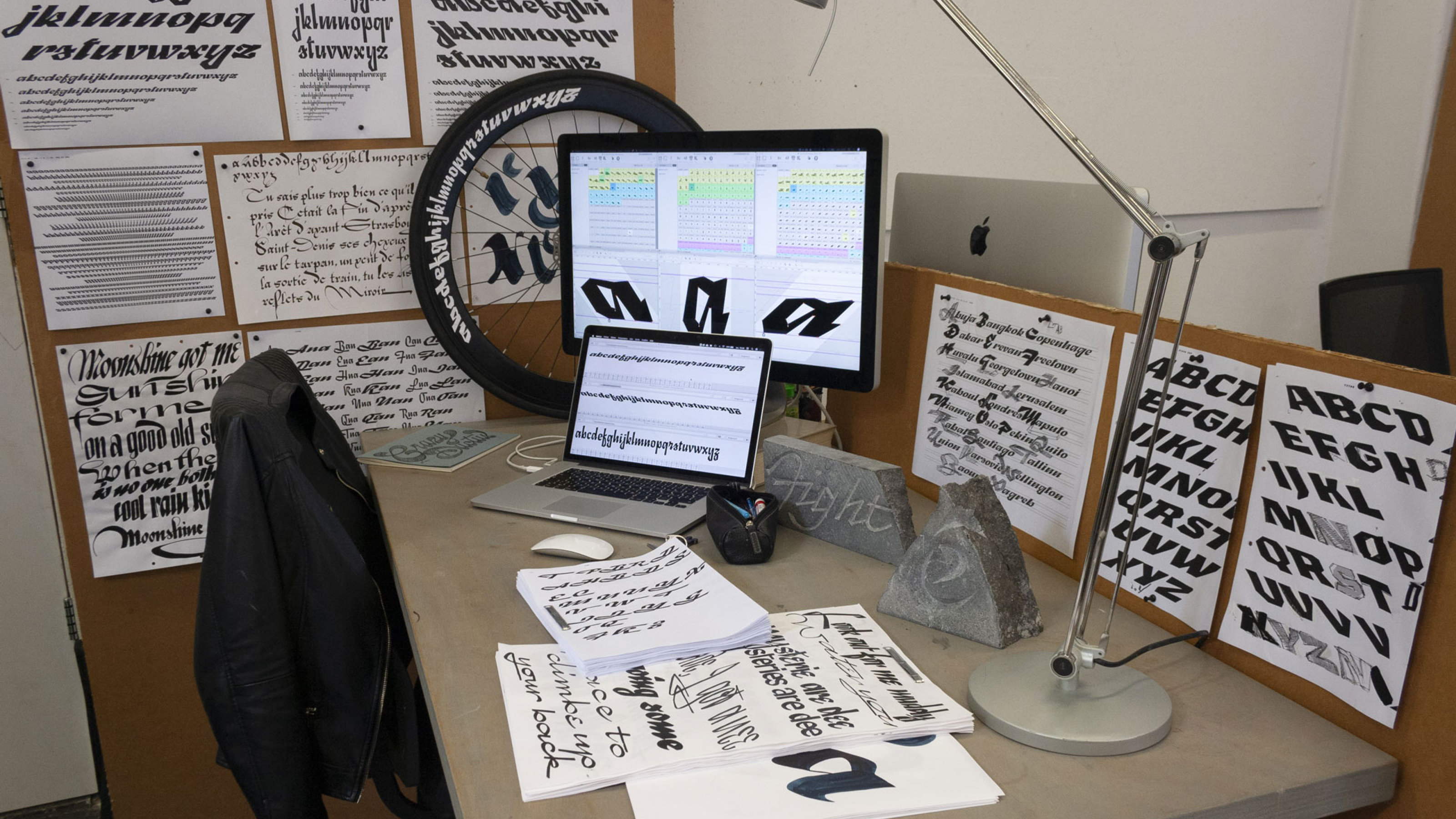
Léna studied graphic design and type design in Paris (Estienne), she did an Erasmus internship on the Swiss Riviera that made her stay in Switzerland. After her year at Type and Media in the Royal Academy of Art, she is back to Lausanne and now works as a type and graphic designer, sign painter, stone carver and calligrapher.
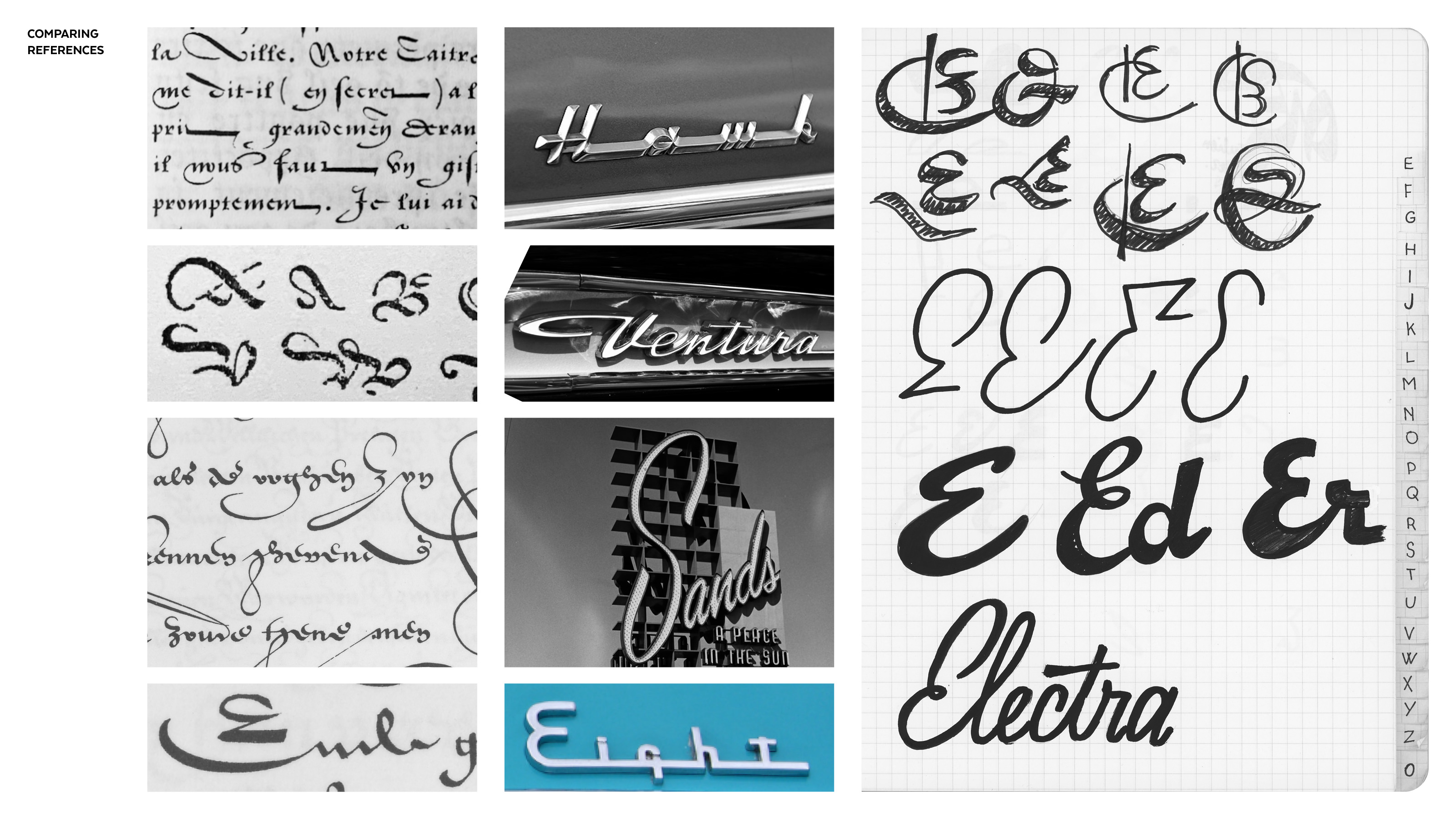
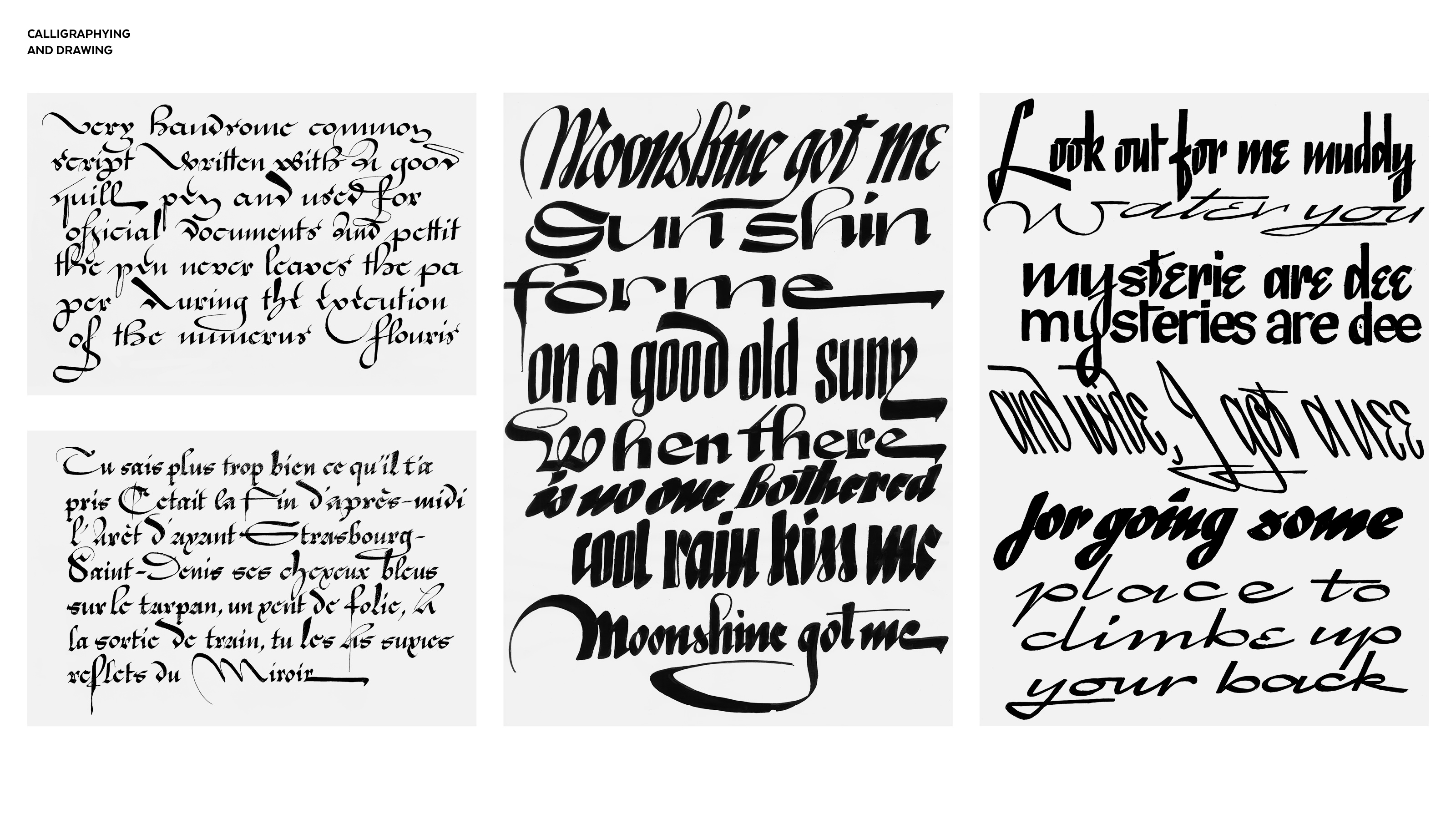
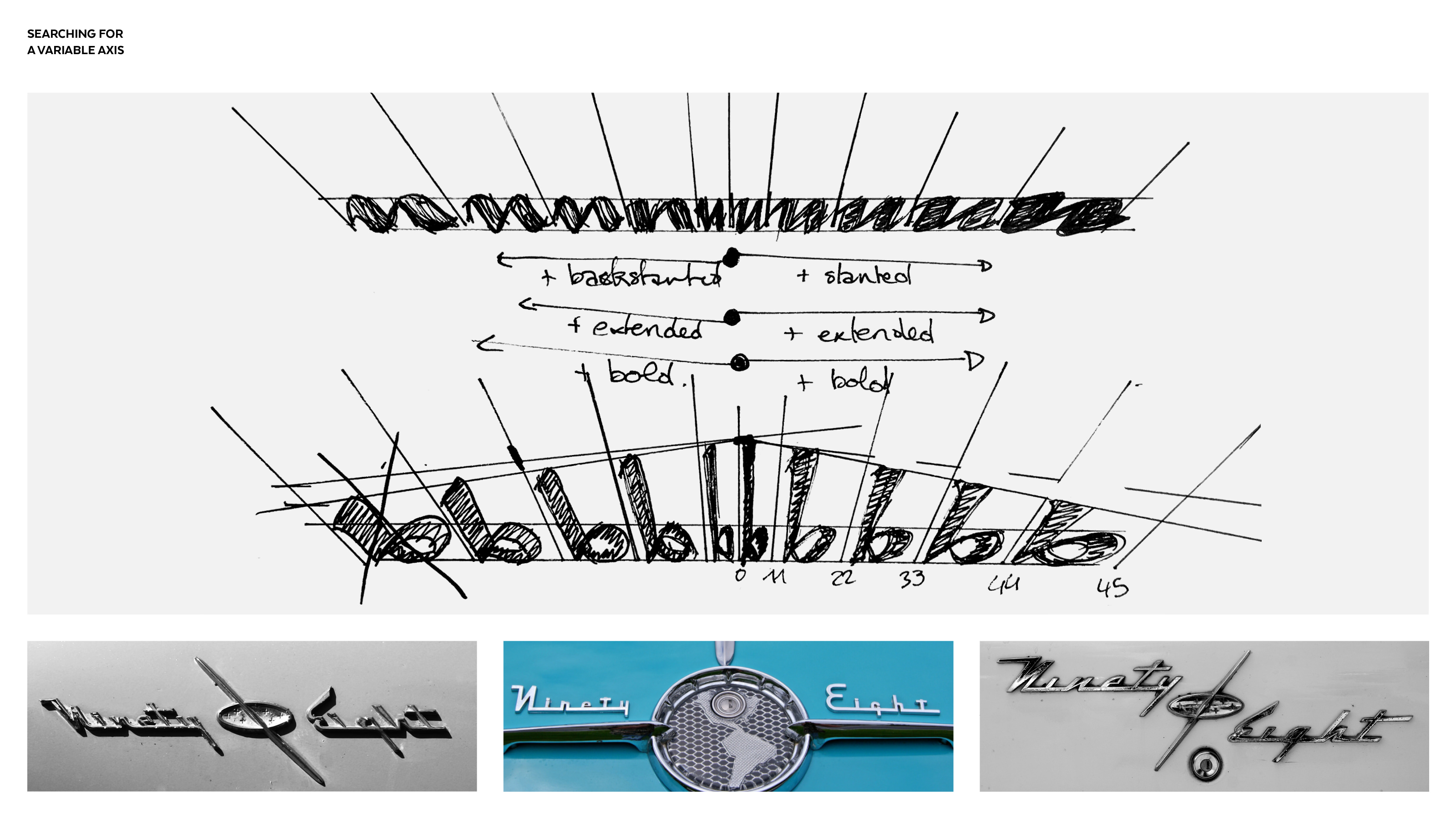
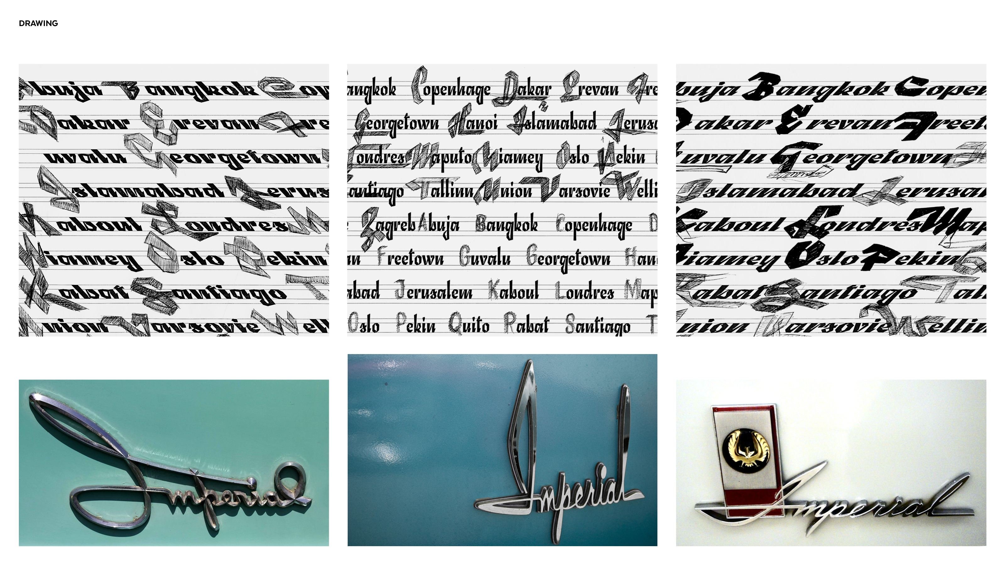
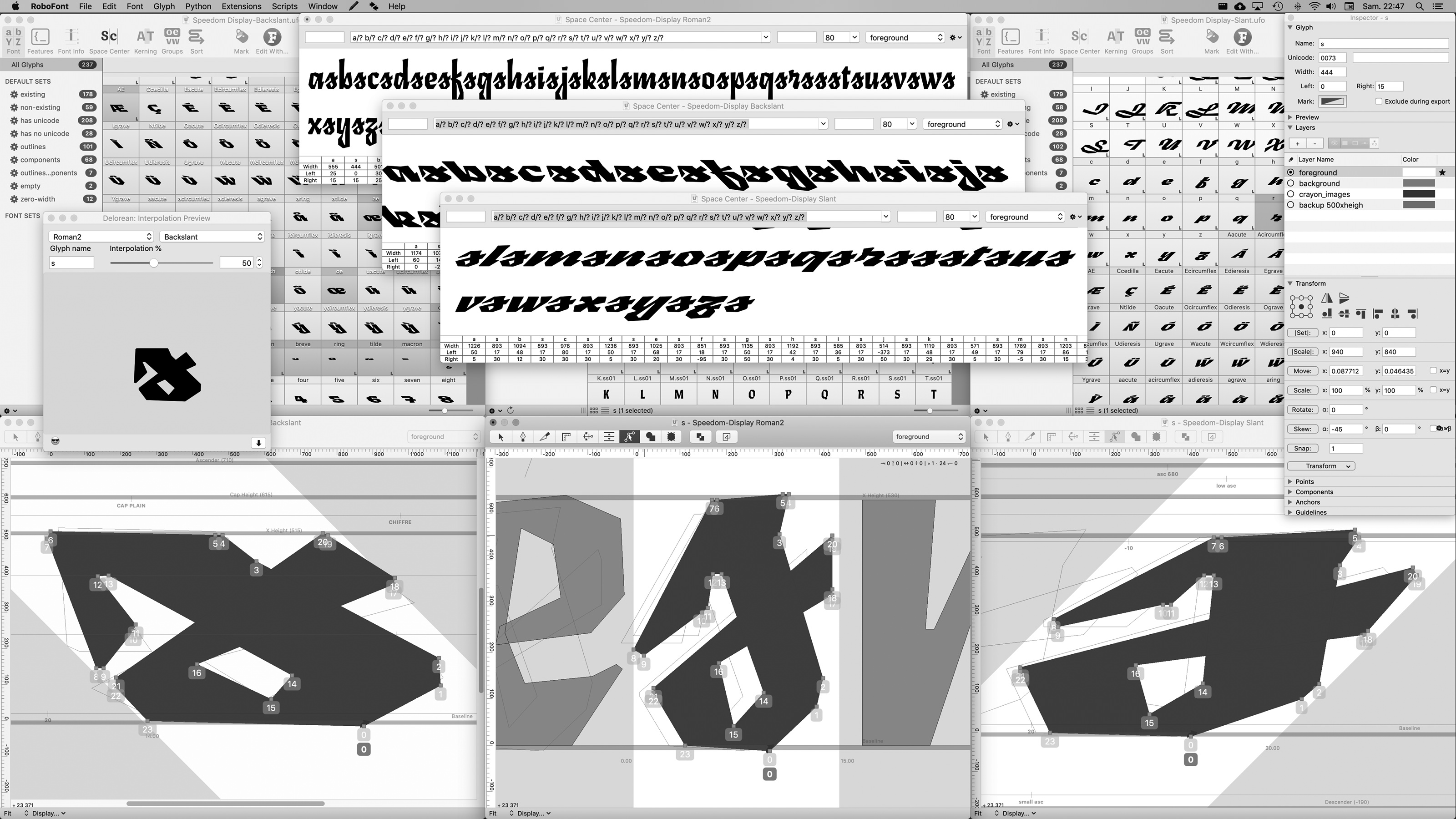
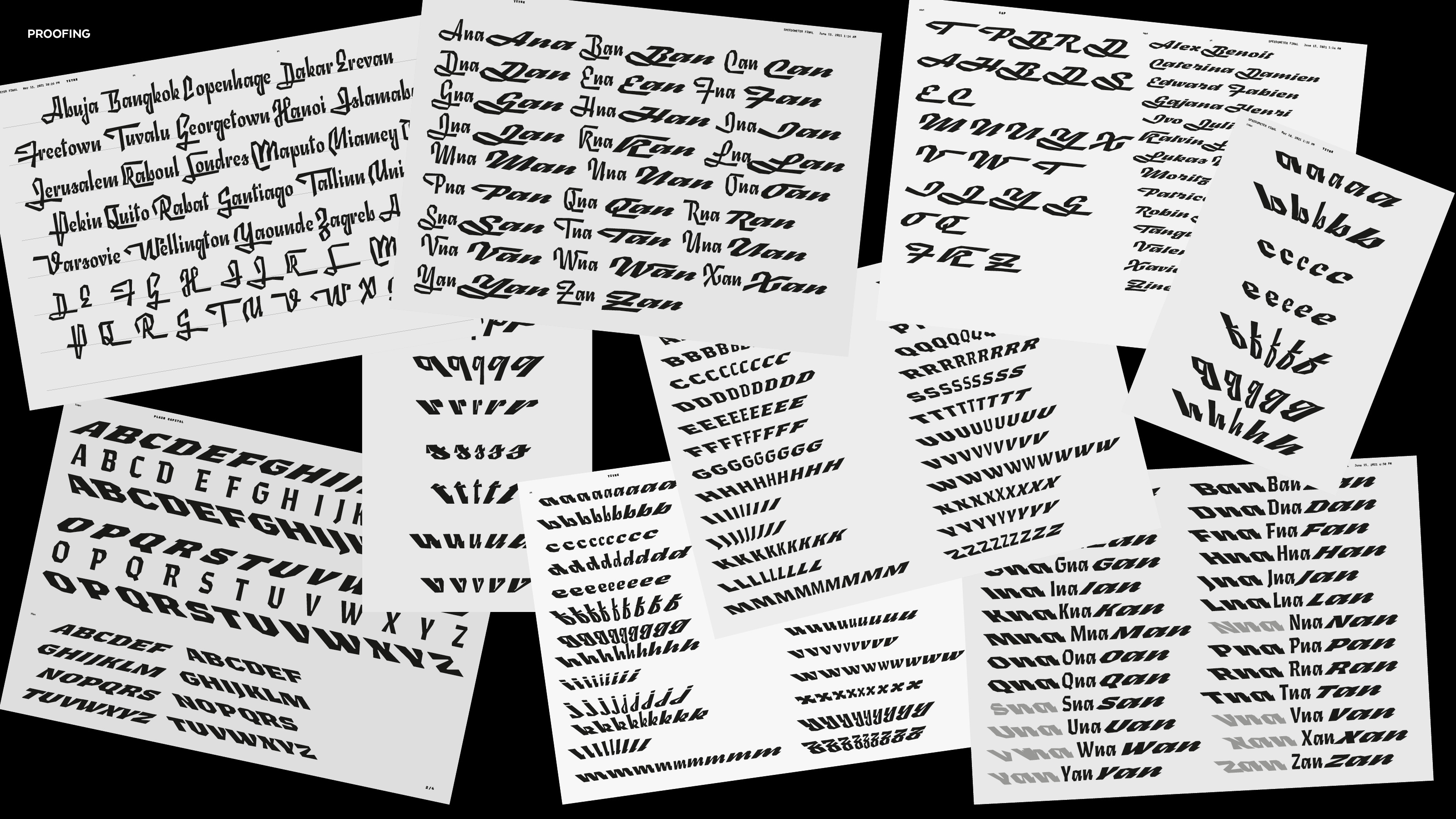
How come the Civilité writing system shares so much, in terms of shapes, rhythm and construction, with the retro car lettering? The study of those two beautiful models made me draw many kinds of shapes. I wanted to build a typeface inspired by the flowery calligraphy of the 17th century and the retro display lettering from the 50’s, while experimenting with the variable font technology. For that last matter, I imagined a combined axis, named Speedometer, that was directly inspired by the cars. I discovered that some chrome lettering were designed in slant, backslanted and upright for respectively the right side, left side and front side of a car. After I fixed those parameters, I continued drawing, proofing, refining the shapes of the three sources, and enriching it with two sets of uppercases: plain and initials. For the moment, Furya comes only as a variable font but different cuts will be determined. This typeface will be refined, developed and released within the type foundry Coppers and Brasses.
