Neva Zidić is a type & graphic designer from Croatia. Before moving to The Hague to study at Type and Media, in 2020 she completed her MA in Visual Communications in Zagreb's School of Design. She is now based in Zagreb, where she works at the graphic design studio as well as on freelance projects. Since 2021 she is an associate at the Academy of Applied Arts in Rijeka, teaching type design and typography.
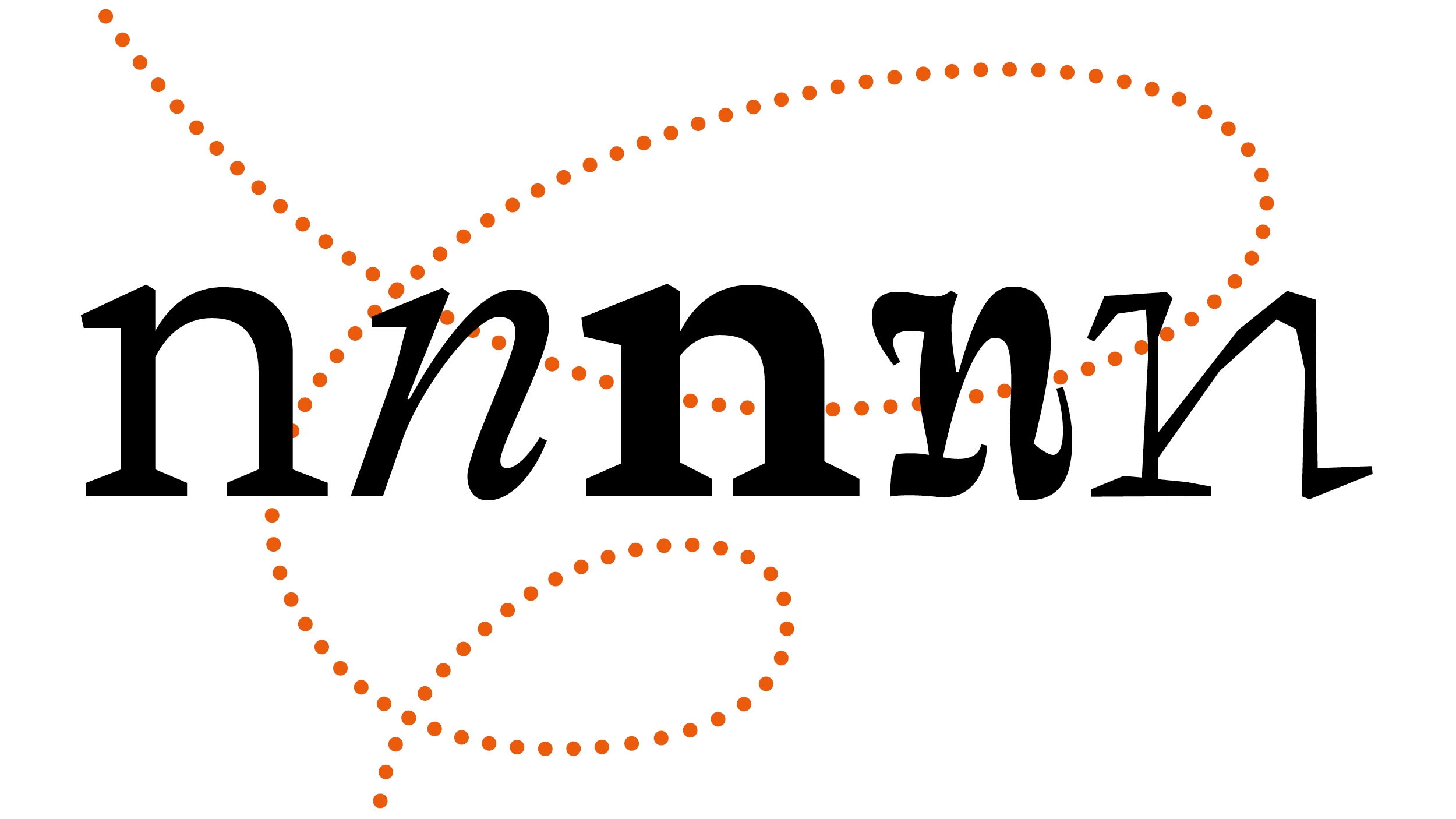
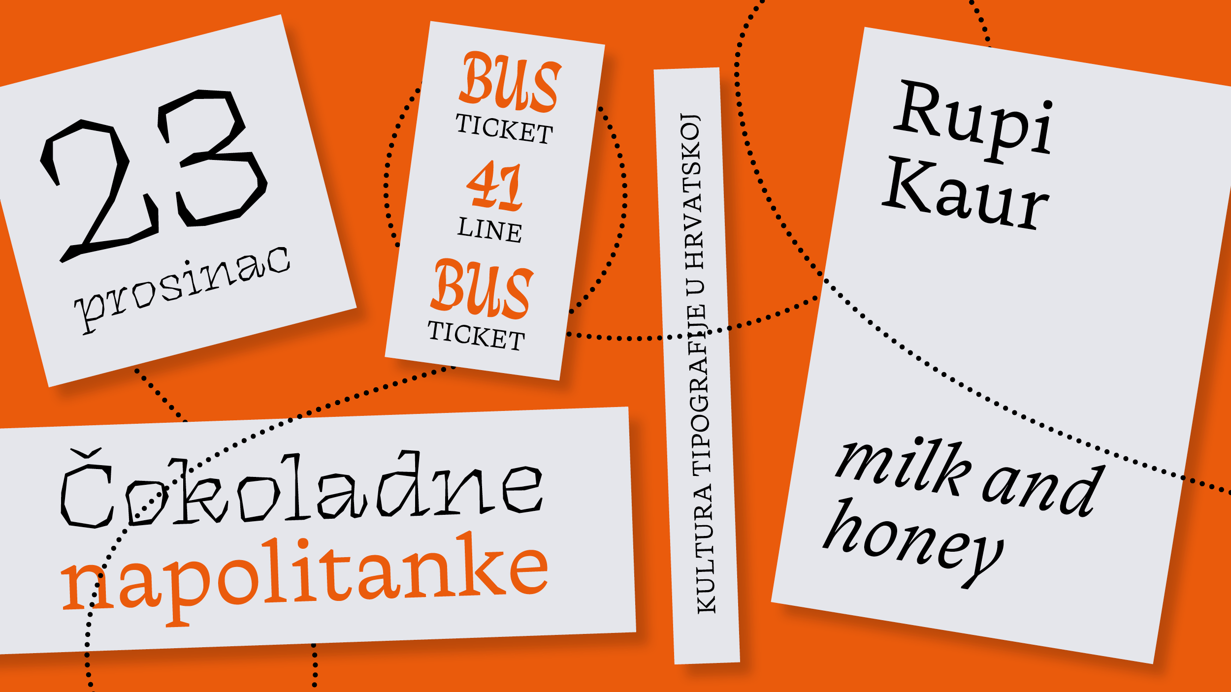
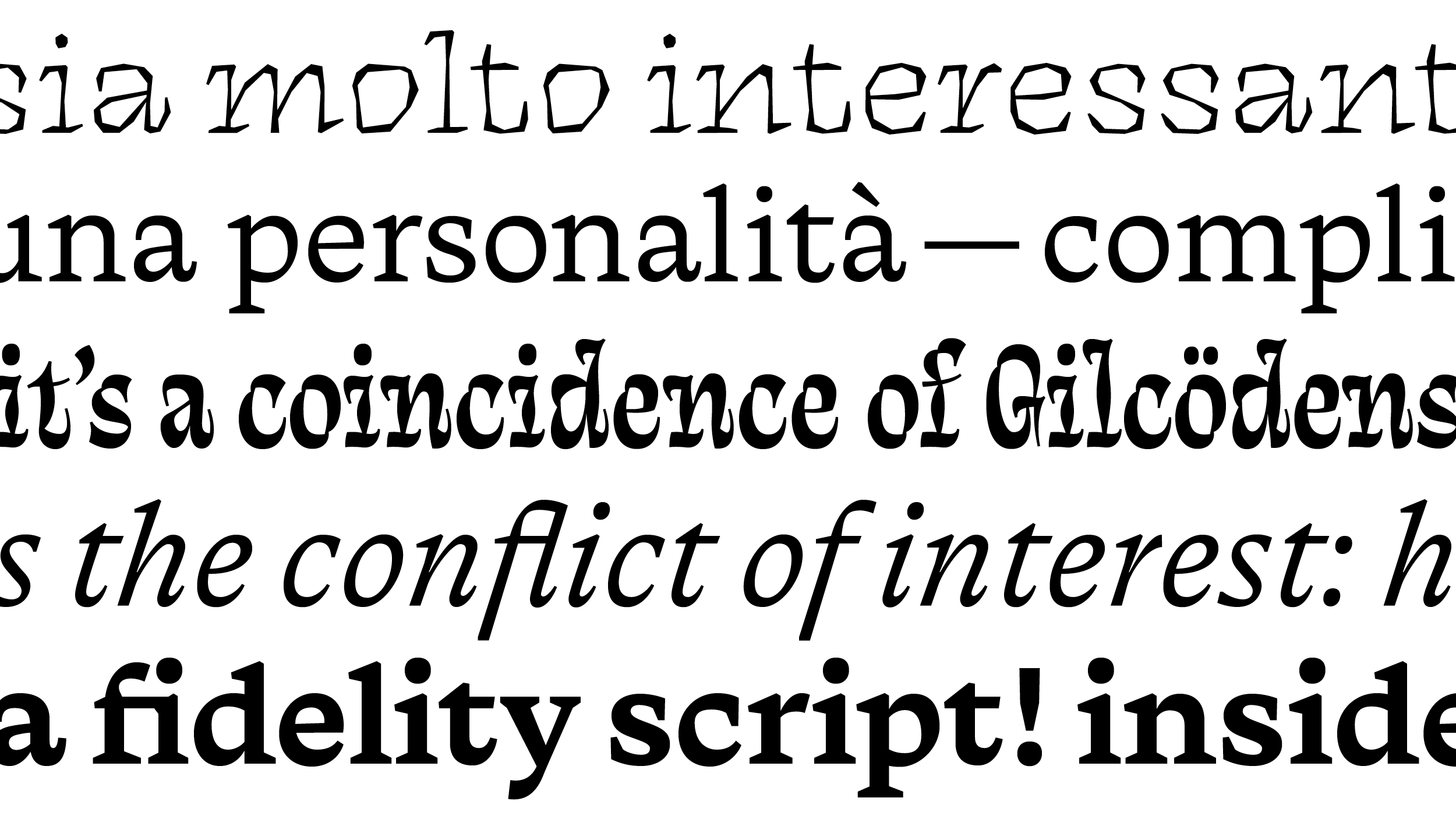
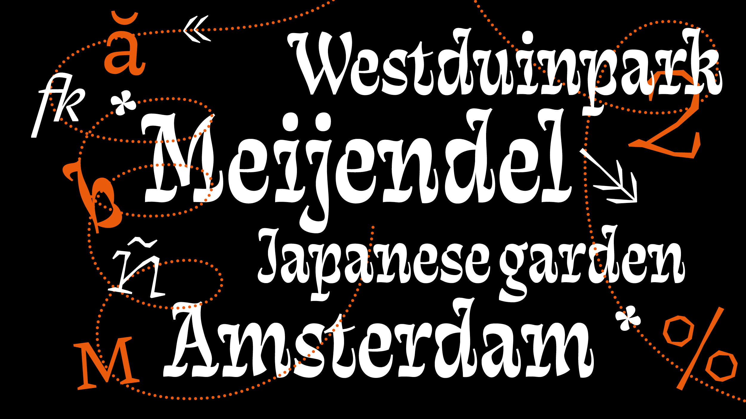
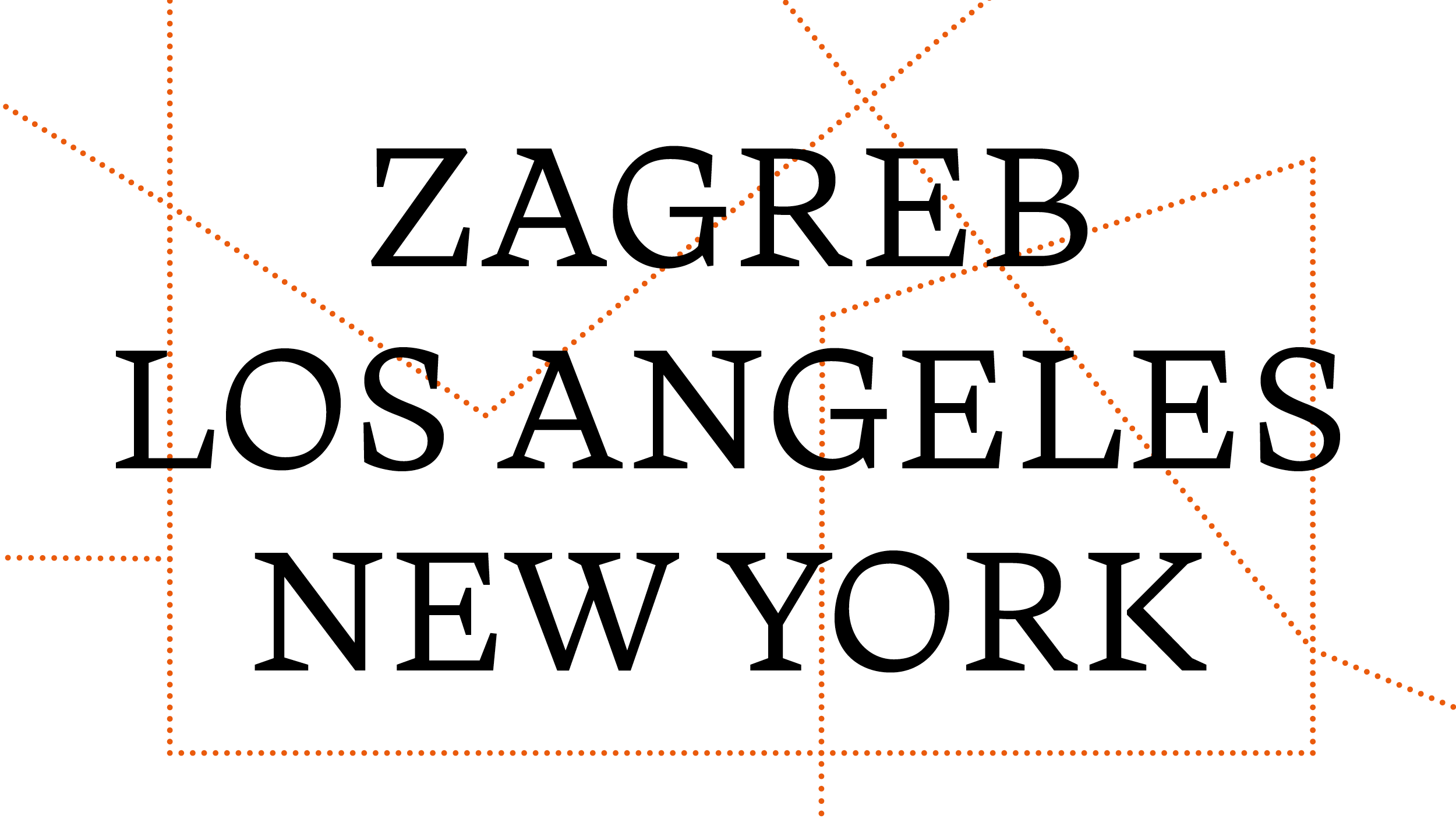
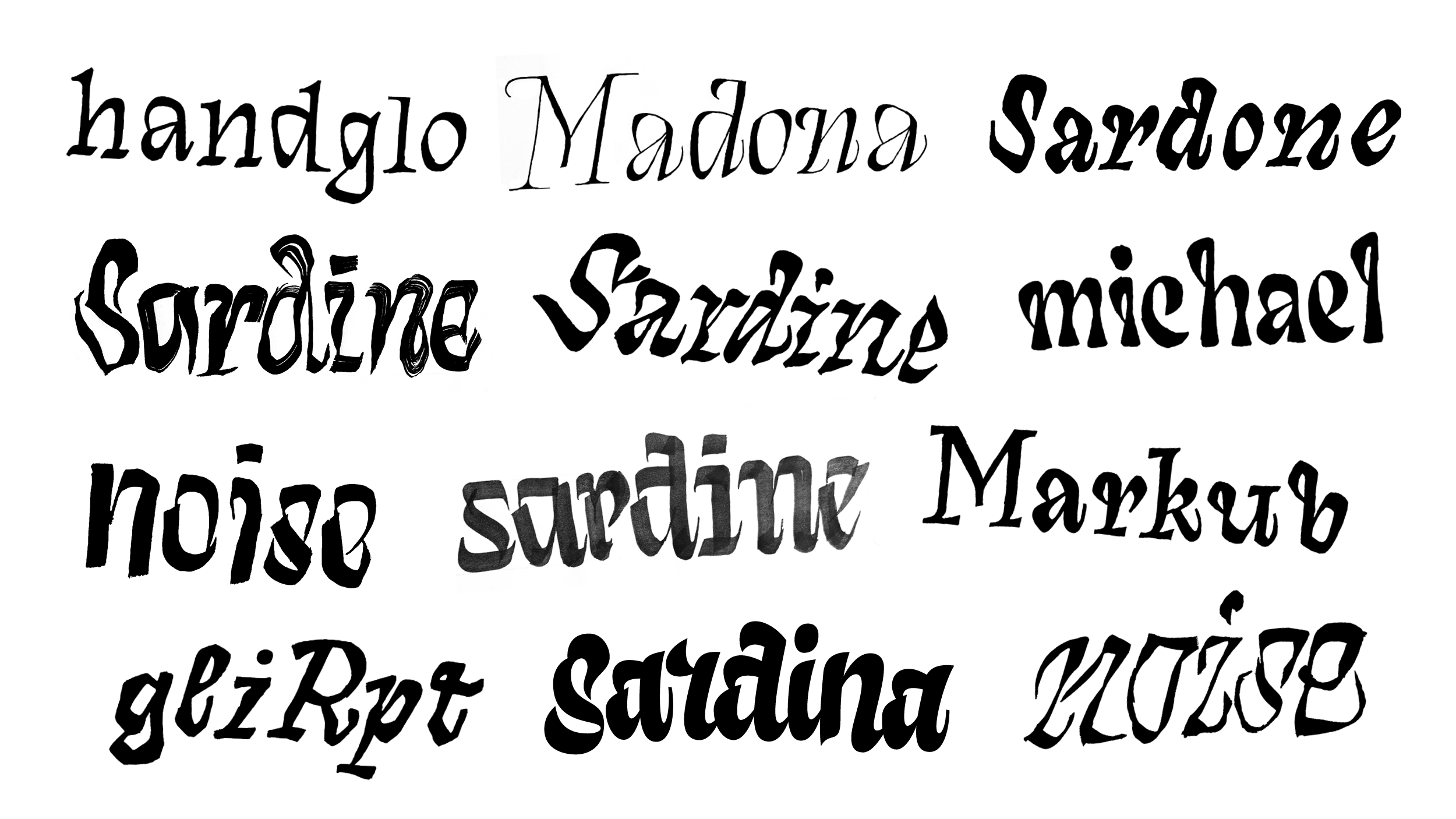
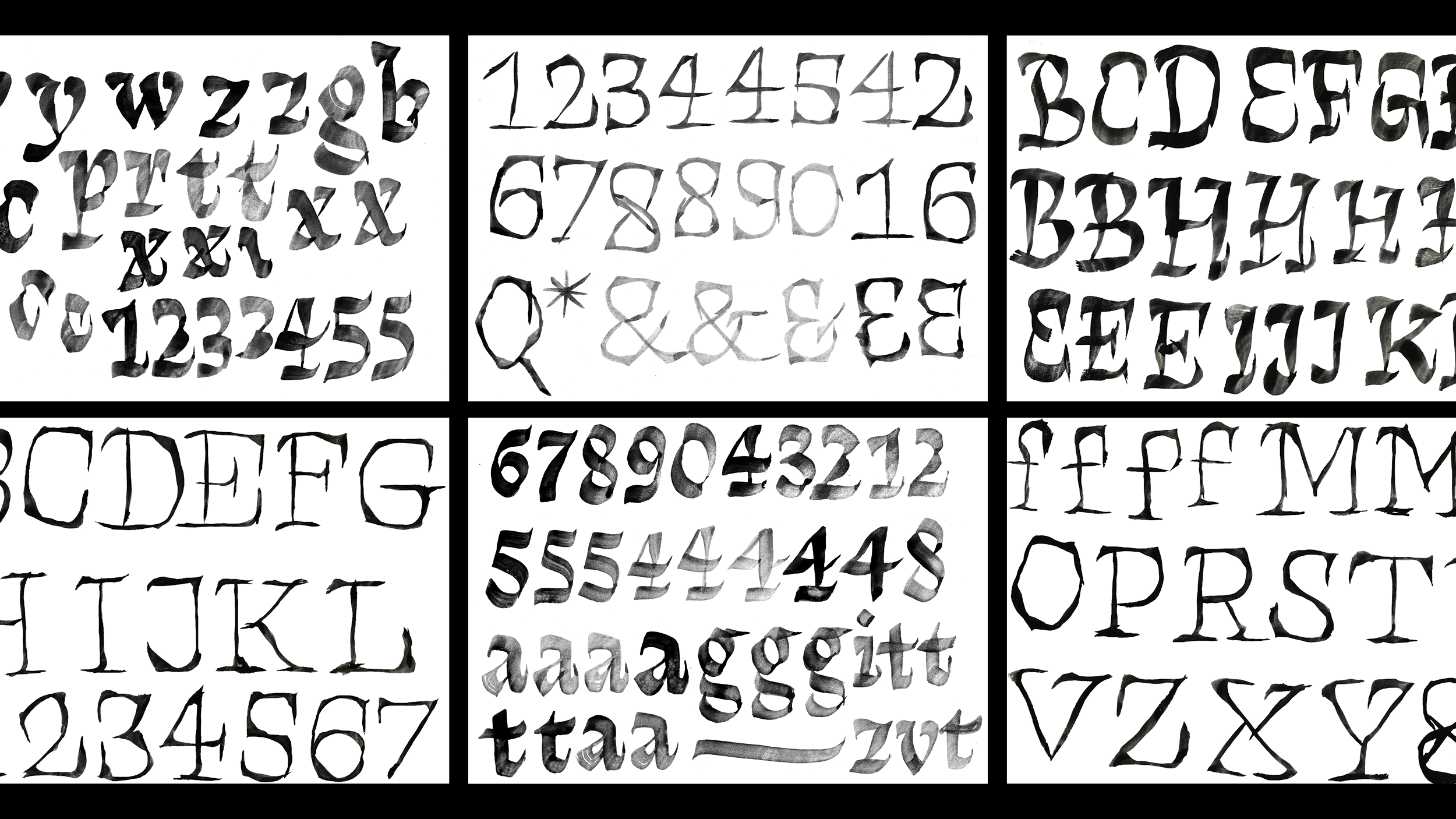
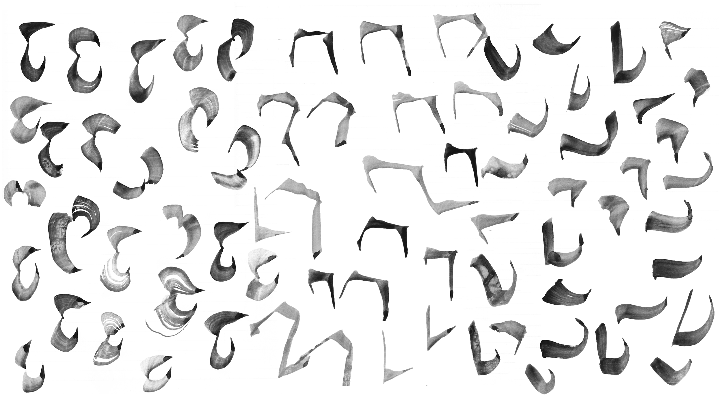
The initial idea for the final project at Type Media was translating the concept of introvert and extrovert personalities into the letters and visualising their opposing element. With the introduction of the flat brush as the main tool for experimenting and sketching, the topic broadened to an exploration of many contrasting personalities through letters, as I was fascinated by the amount of forms that were being achieved simply by manipulating different parameters when writing with the brush.
I gathered all the sketches that were giving me the most contrasting feelings - from loud, bold, eccentric to shy, fragile, introverted ones. However, I noticed that they all shared quite some characteristics, which answered my constant doubts if it makes sense to combine something so different.
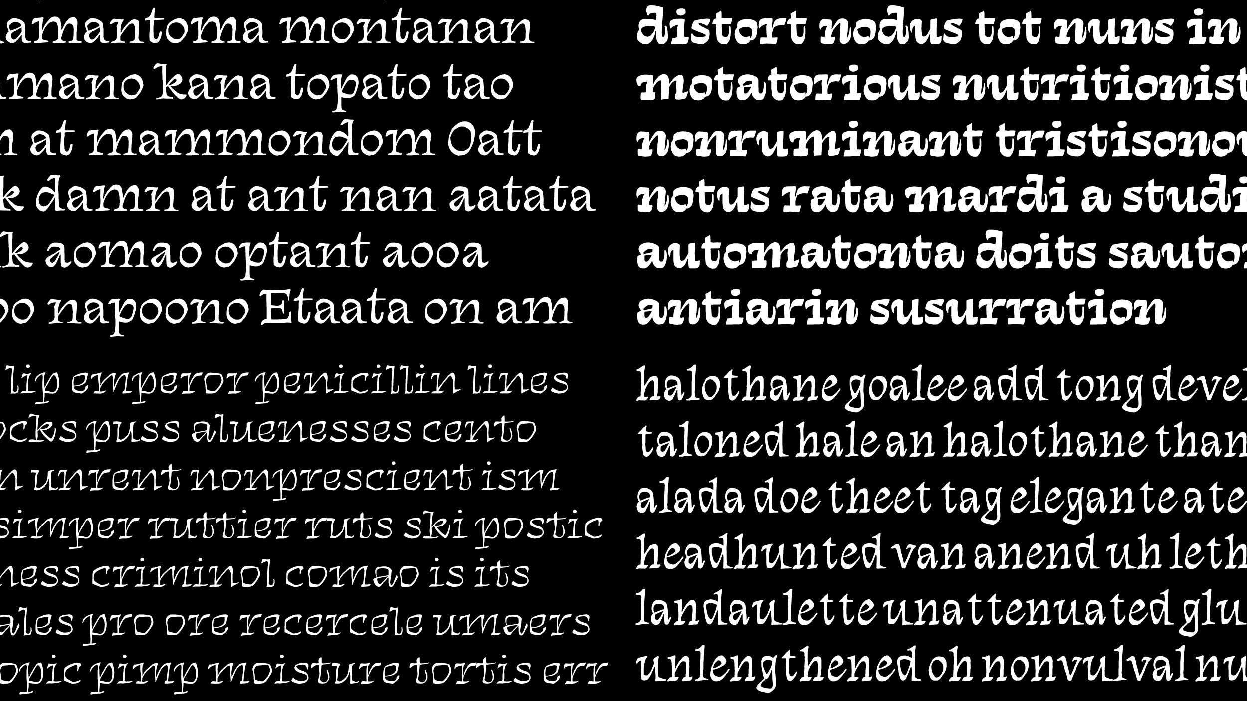
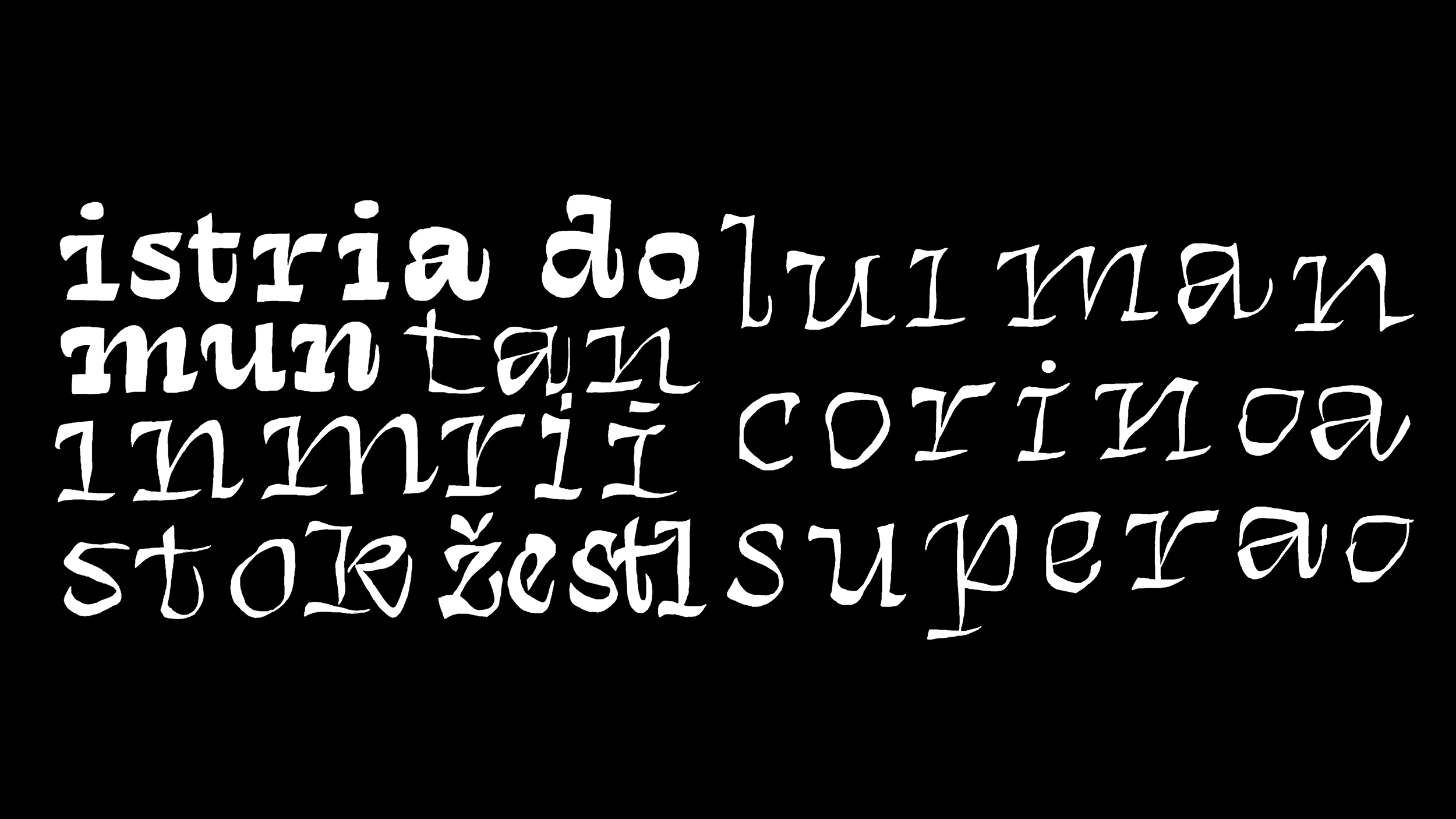
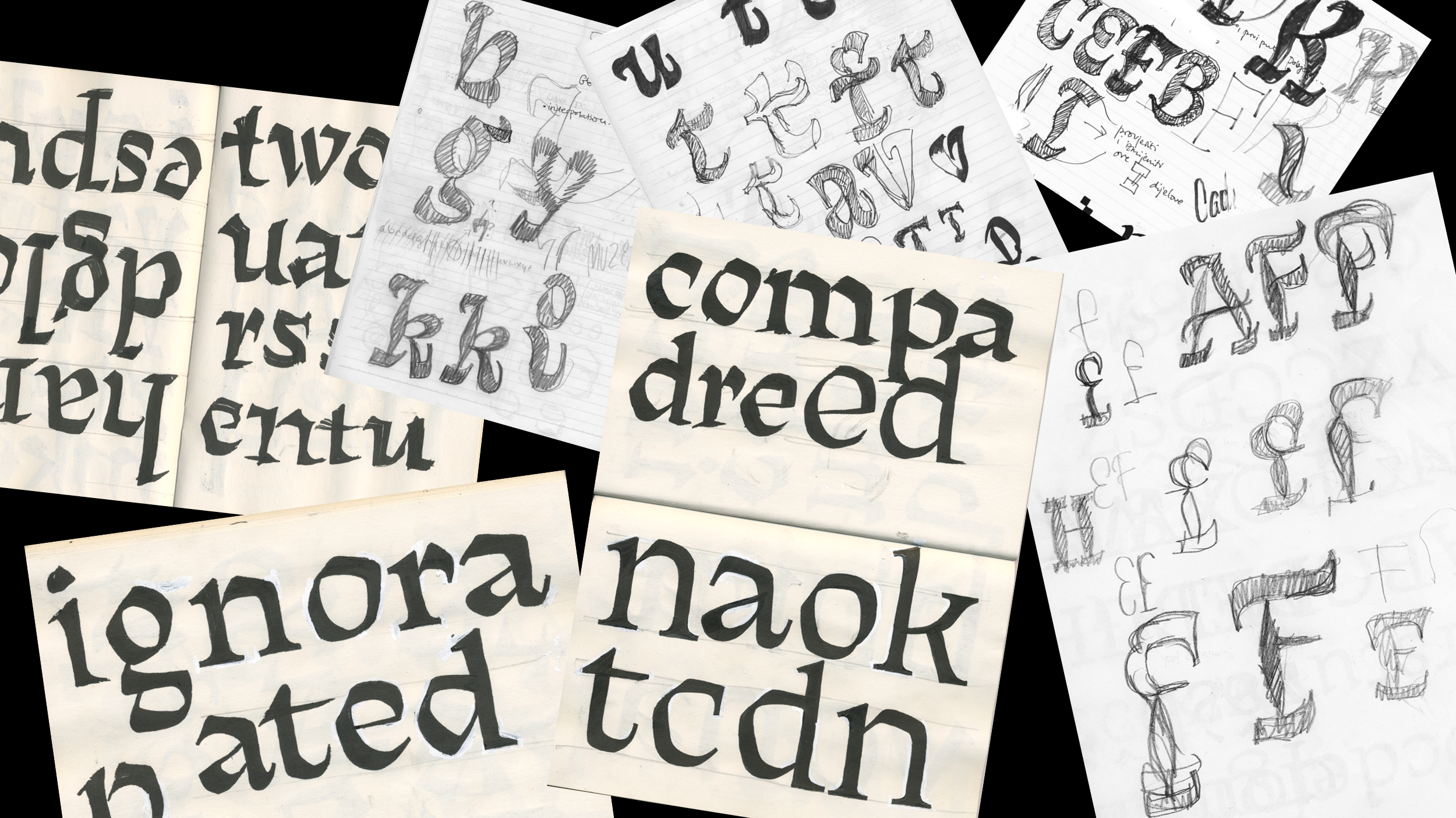
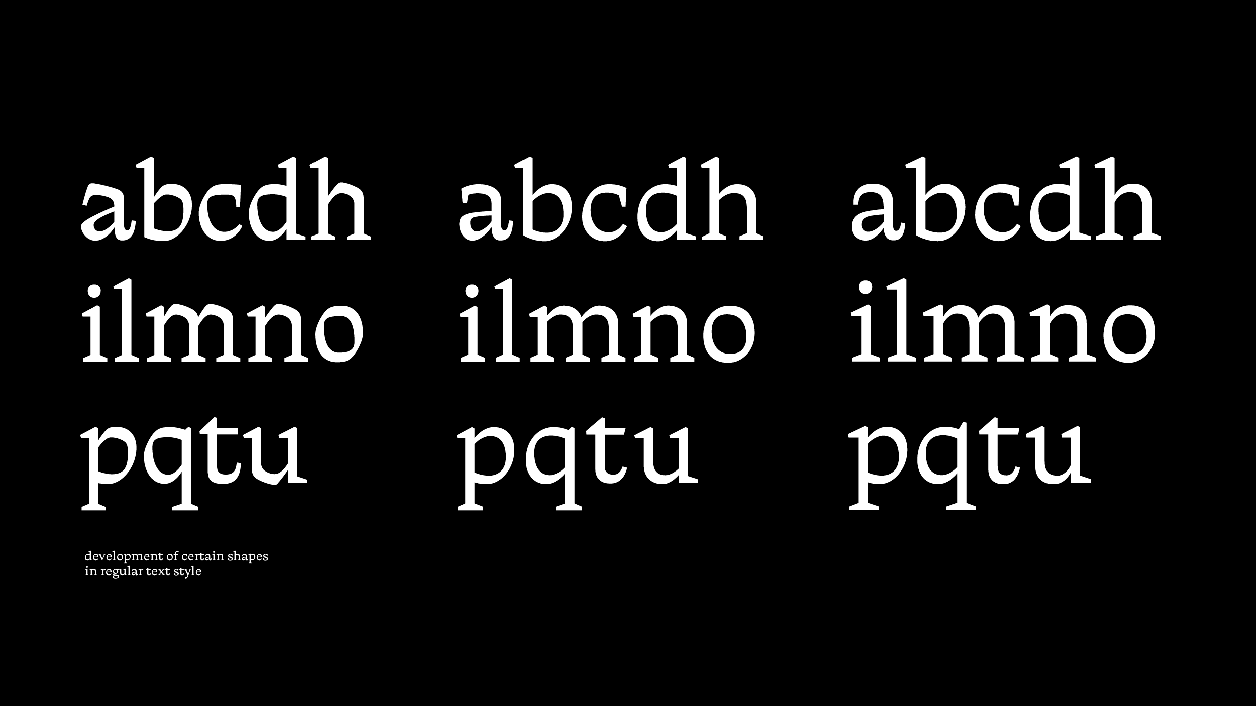
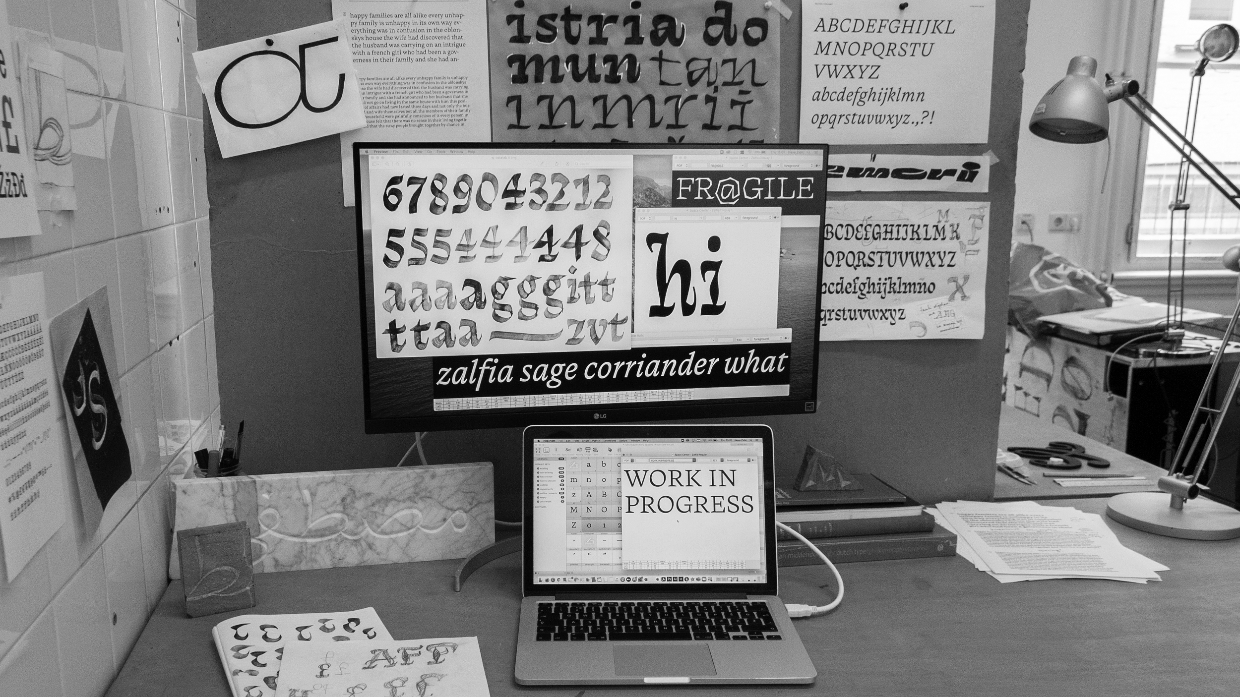
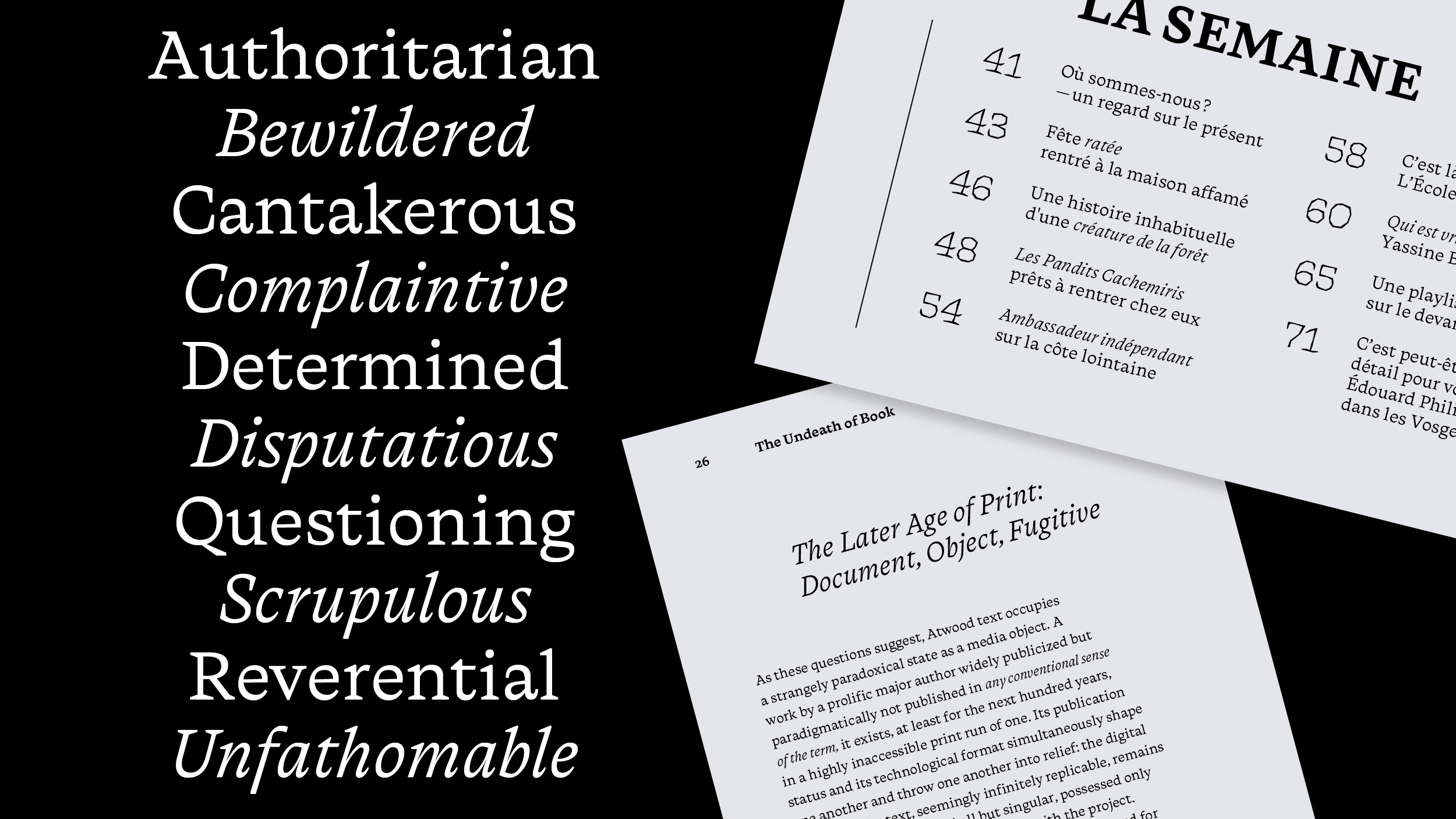
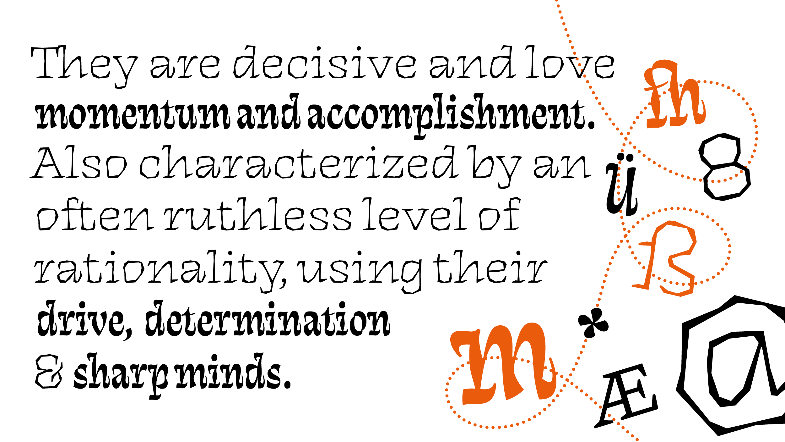
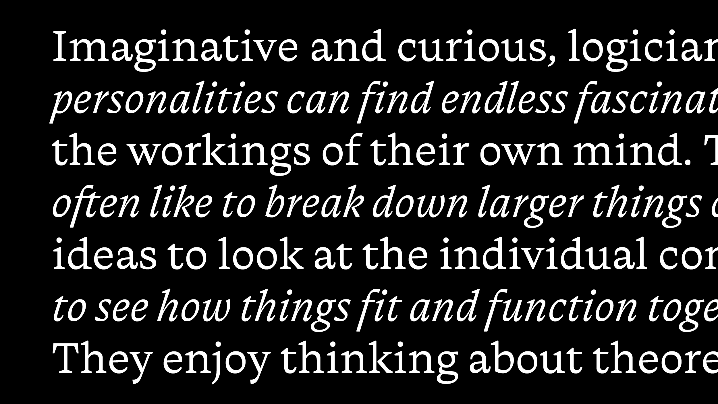
Limited by the amount of time, I narrowed my choice to just few expressive sketches for display styles and a text style. While working on display styles was challenging for trying to translate the vibrancy of the brush strokes into digital drawings, which required constant switching between hand and digital drawing; working on text styles had its very own challenges. Even though I expected to come to the text style by tuning down the characteristics of display styles, it was a way longer path, which again required going back to writing with the brush and searching for new solutions. Therefore, between adding more crazy displays and working on the text part of the family, I felt the latter was my priority at the time.
That shifted my focus in another way than I expected and influenced the final outcome of the project, but also made for a more balanced and functional family and gave me the opportunity to learn more in different areas.
